INTRODUCTION
It’s natural for people to have preferences when it comes to colour selection. The reason why we prefer some colours to others is that it has a sentimental or emotional attachment to us. But in interior design, colour selection is a lot more complex than merely choosing your favourite wall colour combination. It involves art, science, and a lot of visual circuses to fully pull off a coherent design composition that is well balanced, and pleasantly attractive.
Interior designers understand how colours work and they use a particular process when it comes to selecting the wall colour combination for the living rooms, kitchens, and bedrooms. We call it Colour Theory. In this blog, we’ll talk about it in detail and give you a list of wall colour combinations that you can incorporate into your space.
What Is Colour Theory?

The study of colours and how to employ them in harmony is known as colour theory. It’s useful in design since it helps to create a palette that complements each other. Interior designers refer to the colour wheel which is divided into 3 sets of colours namely, Primary, Secondary, and Tertiary. Colour may impact moods, sensations, and visual schemes, so these selections are important in the overall environment of a house.
A colour scheme is a process of using the colour wheel to create appropriate wall colour combinations. A colour combination is also created by combining the 3 sets of colours with the white colour or other neutral hues. Knowing what colours mix well together and how to extract more shades from the basis of each hue is essential for an interior designer trying to brighten up their house.
Below are the most important colour combinations you should know:
1. Analogous Wall Colour Combination
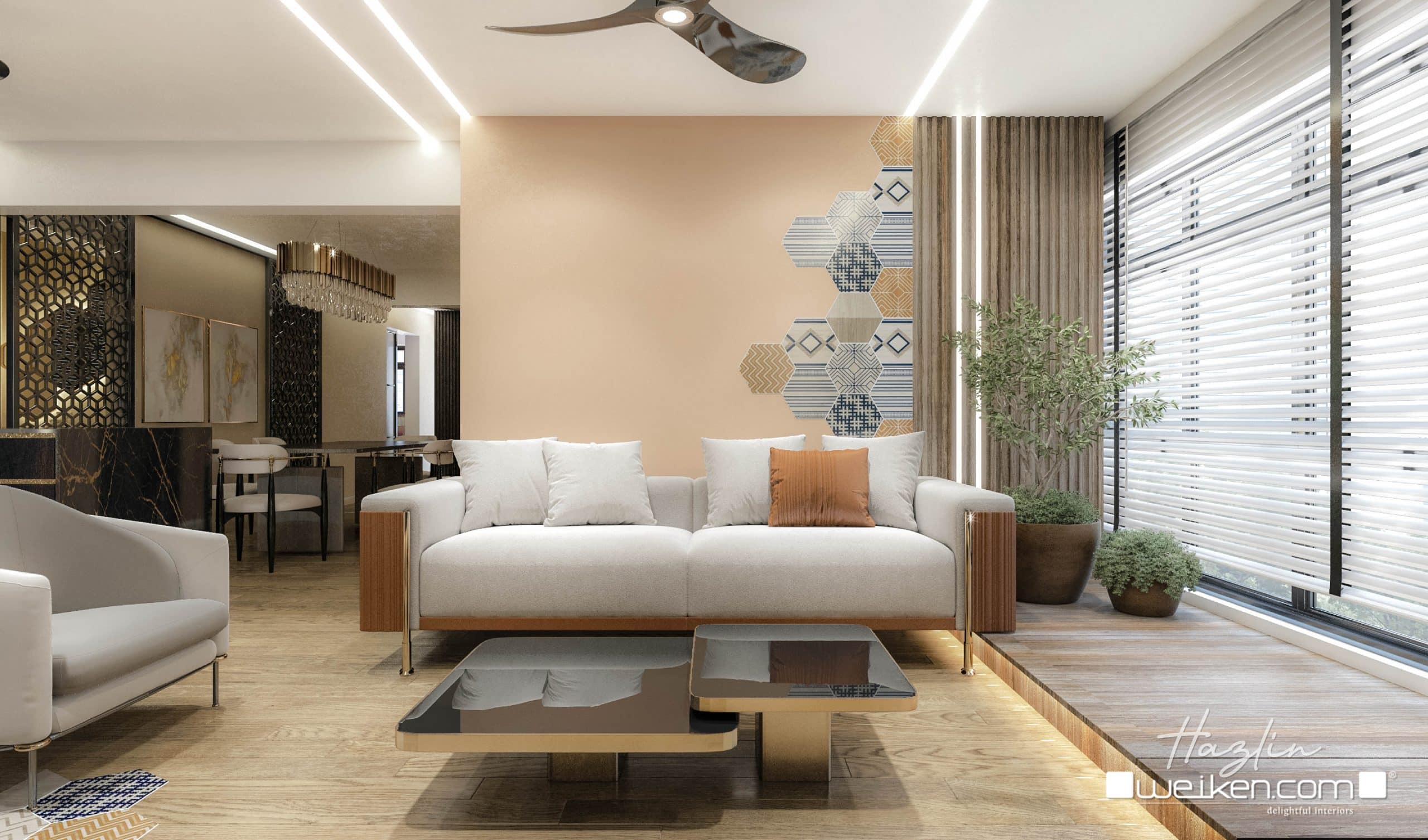
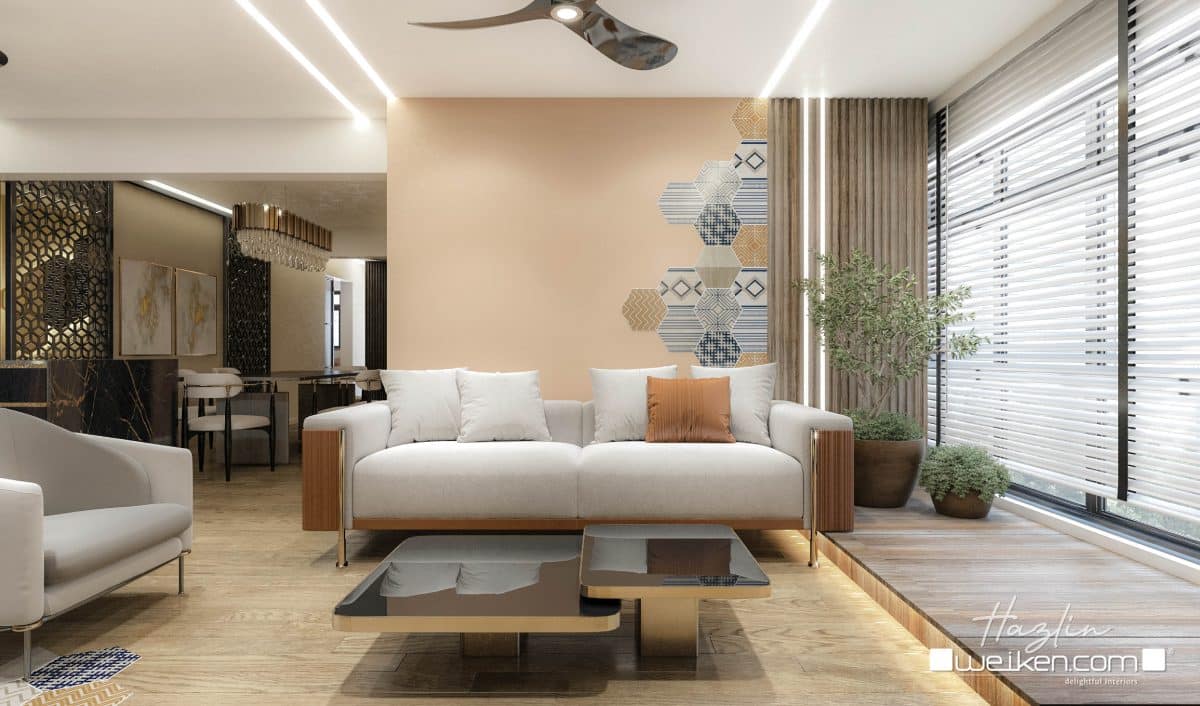
Whether you’re looking for a wall colour combination for living room for bedroom, kitchen, dining space, or living area, choosing colours in the colour wheel that are analogous will keep you on the right track.
Colour schemes that are analogous are made up of colours that are adjacent to one another on the colour wheel. These colours typically appear similar and hence constitute a pleasing colour scheme. Examples of these colours are yellow, yellow-green, green, and red, red-orange, orange.
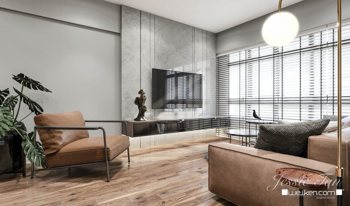
2. Monochromatic Colour Combination
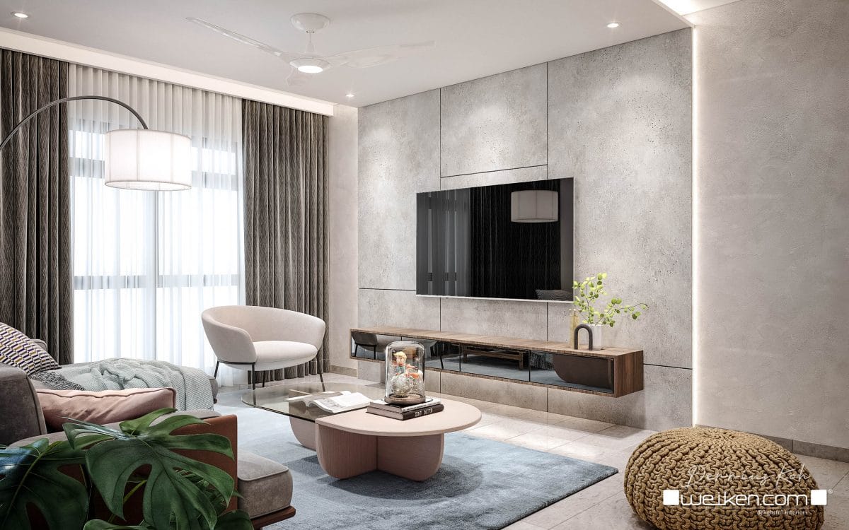
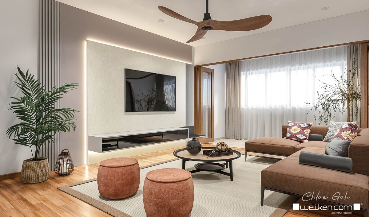
The monochromatic colour combination is by far the easiest way to incorporate colour into almost any kind of space. This implies the use of the same hue but in a variety of tones to create a single and consistent scheme all throughout.
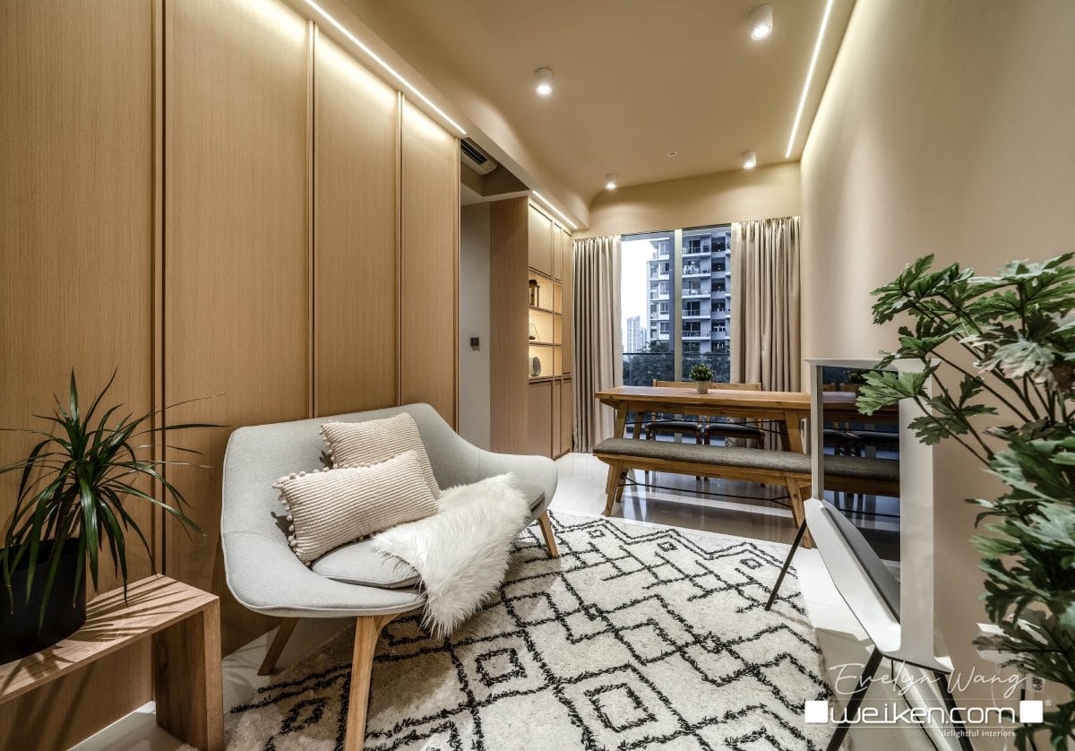
Monochromatic colour combinations are commonly seen in contemporary and minimalist interiors with a lot of beiges, neutrals, greys, and whites. If you are a beginner when it comes to colour selection and interior painting, opting for the monochromatic scheme is the ideal way to go.
3. Complementary Colour Combination
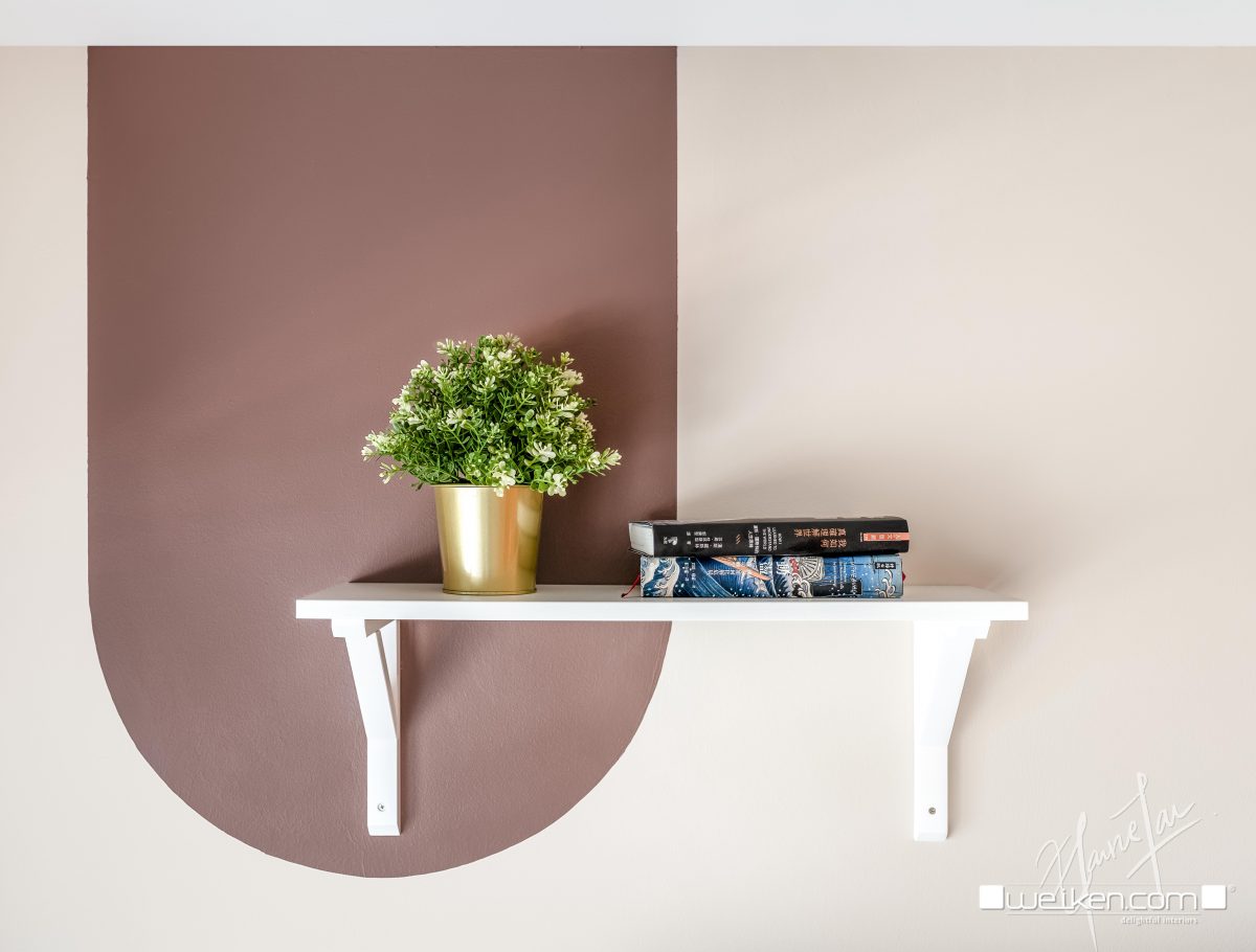
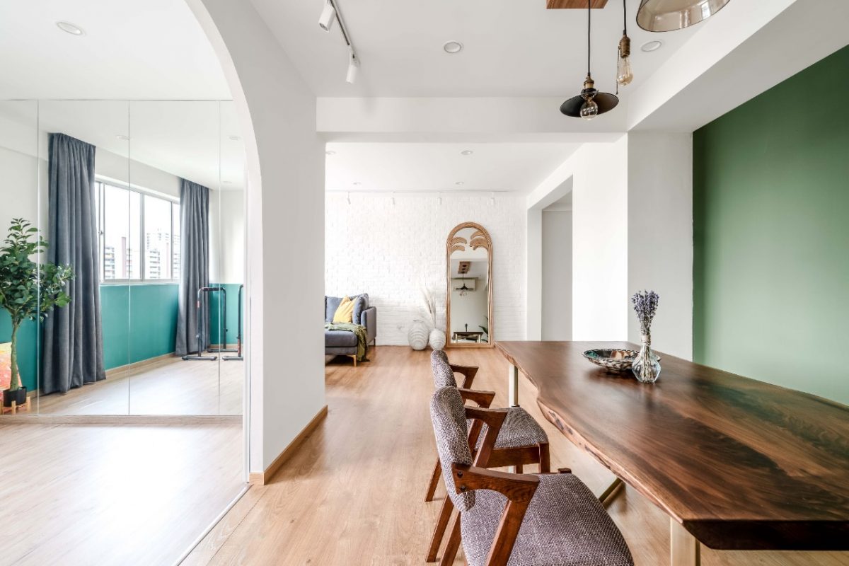
Complementary colour combination refers to colours that are on the complete opposite sides of the colour wheel. These colours are totally different which creates a unique and visually dramatic scheme when they are paired together into a single composition.
This type of colour combination is best used for creating a statement within a space or a focal point wall colour combination for hall that draws the eye and will attract the attention of the viewers.
Examples of complementary colour combinations are: orange and blue, red and green, and yellow and purple. Get a colour wheel so you can see for yourself where these colours are located on the wheel.
4. Split-Complementary Colour Combination
This colour scheme combines two complementary colour schemes that are adjacent to the colour wheel. This produces the same eye-catching effect as complementary colour schemes while also giving designers a few extra colour alternatives.
When a designer uses this scheme instead of merely two complementary hues, it implies a little more competence in the colour choice. Split-complementary keeps the contrast high, but it eases the strain on your eyes. Red + blue-green + yellow-green is an example of a split-complementary colour combination.
5. Triadic Colour Combination
While not always the simplest, triadic colour schemes are the safest option if you want to branch out from one colour. Colour schemes that are triadic are made up of three hues that are equally spaced on the colour wheel.
Triadic colour schemes, like complementary colour schemes, offer observers dramatic contrast. Triadic colour schemes, on the other hand, produce this impression without disrupting the serenity of the colour combination. “Red, yellow, and blue” | “Purple, green and orange” are two examples of triadic colour combinations.
6. Tetradic Colour Combination
This colour scheme consists of two complementary pairs and is also known as the double-complementary colour scheme. Because these colours can be determined by drawing a rectangle on the colour wheel, they are also known as “rectangular colours.”
When divided into equal proportions, these hues might be a little frightening to look at. Choose one of these hues as your dominating colour and use the other three as accents to avoid visual incoherence.
The Key to Understanding Colour Combinations
Selecting colours to paint your living room or bedroom is a fun and exciting process. However, keep in mind the rules of colour theory so you can avoid making costly mistakes. A painting project is expensive, time-consuming, and a very meticulous process.
Therefore, before you get ready for painting, you have to make sure that the colours you pick are appropriate, well-balanced, and visually coherent. Understand how colour theory works and you’ll definitely have no problem when it comes to selecting colours whether it be for your interior space or any other kind of design output where colour plays a major role.
We hope you have learned the basics of colour theory in this blog, and at the same time, given you an idea of what wall colour combination is best for your interior space. If by any chance, you feel like you need the help of an expert’s eye in selecting the right colour, don’t hesitate to reach us. We’d be glad to help you select the right colour combination to make your home come to life. Drop your email below and let us know how we can be of help.