Weiken Interior Design
Leading Home Renovation Brand
Crafting Spaces & Making
Dream Homes Come True Since 1996.
Our Story
Established Since 1996: Singapore's Leading Interior Design Brand
Weiken | 维康 has been at the forefront of the interior design Singapore industry since 1996. We are proud to be widely recognised as one of the best interior design companies in Singapore. Renowned for our creative, aesthetic, and functional design solutions, we are committed to delivering results that truly reflect our clients’ personalities and lifestyles. Our reputation is built on a foundation of friendly, attentive service and a consistent track record of exceeding client expectations.
Interior Design &
Home Renovation
Space
Planning
Material
Selection
Project
Management
Why Choose Us?
One-Stop Home Renovation Solution
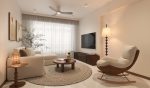
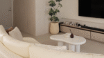
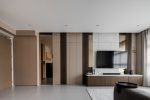
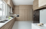
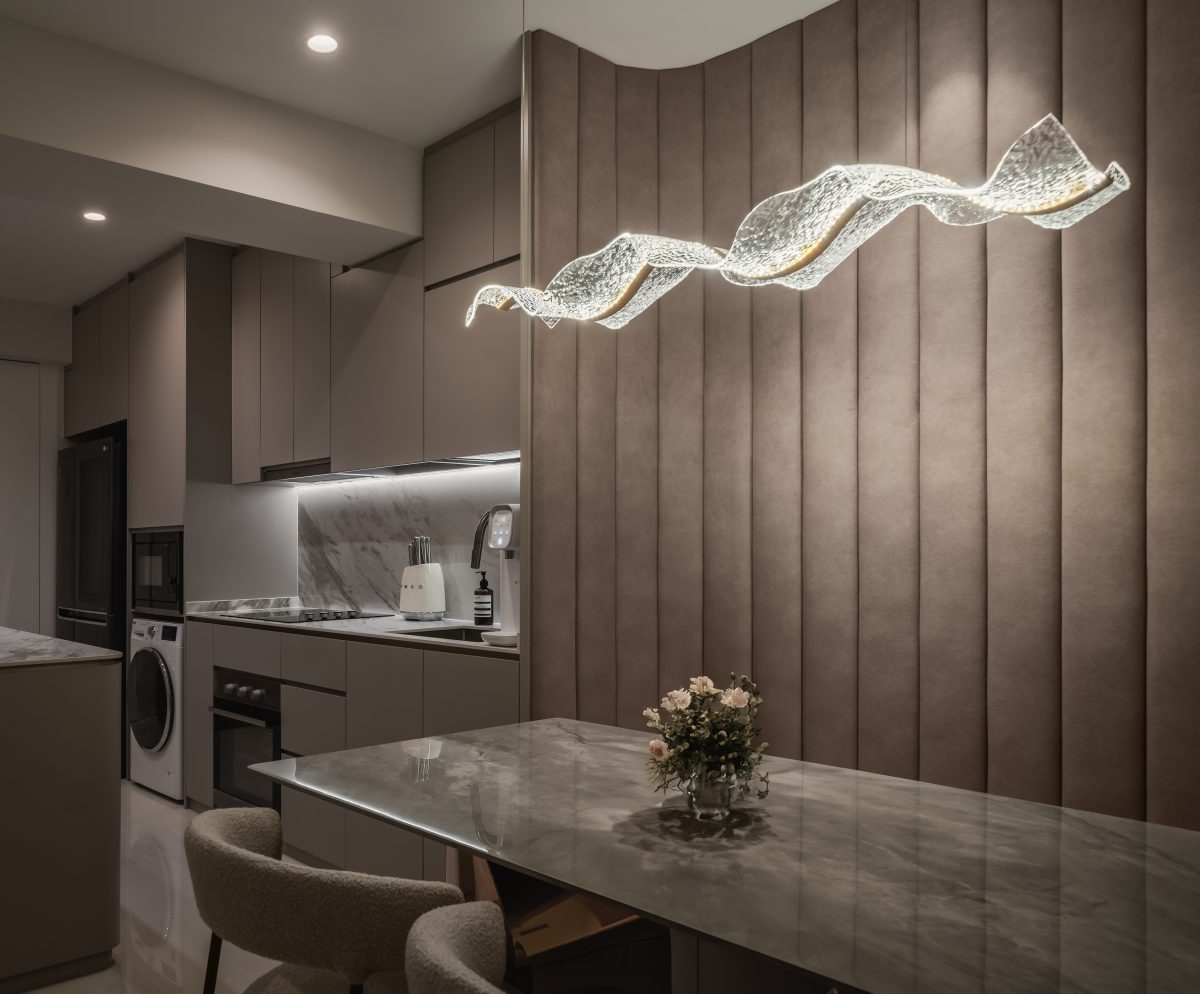
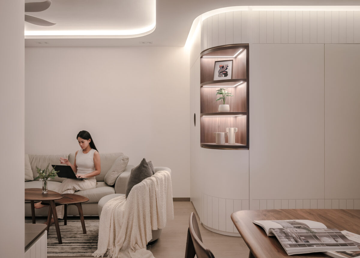
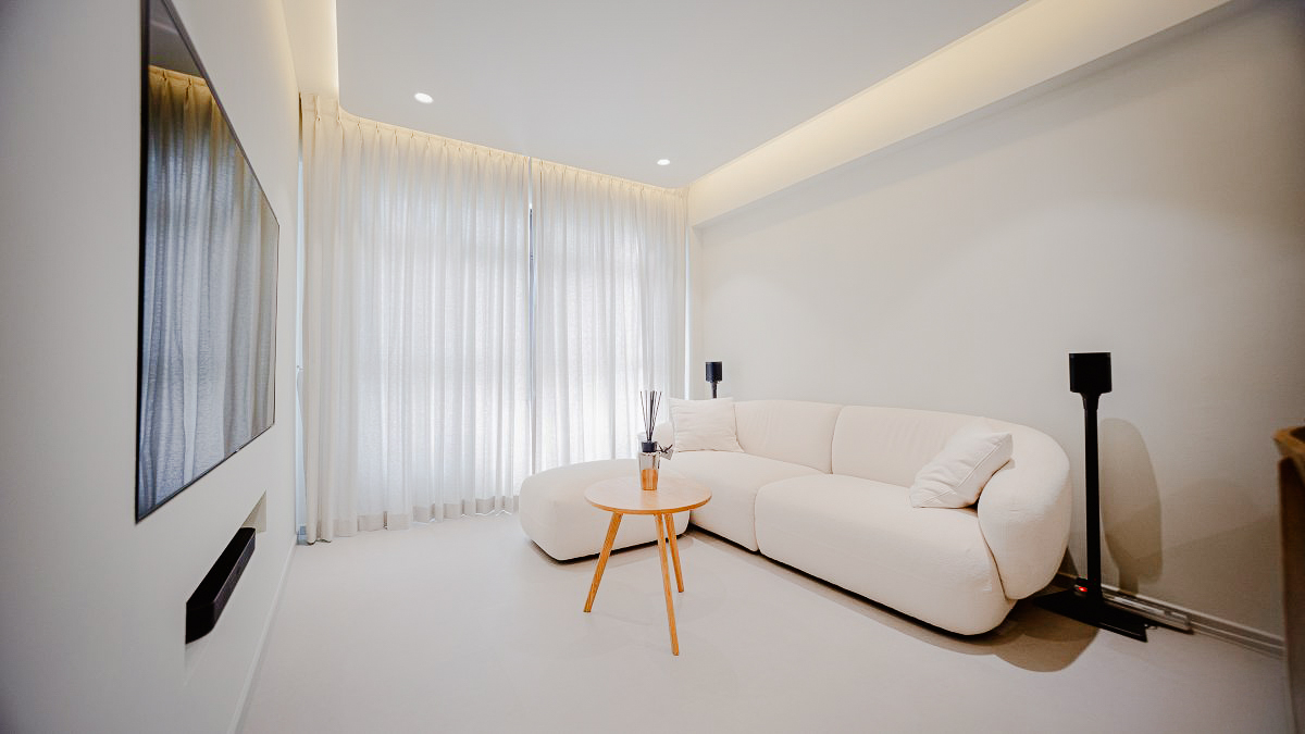
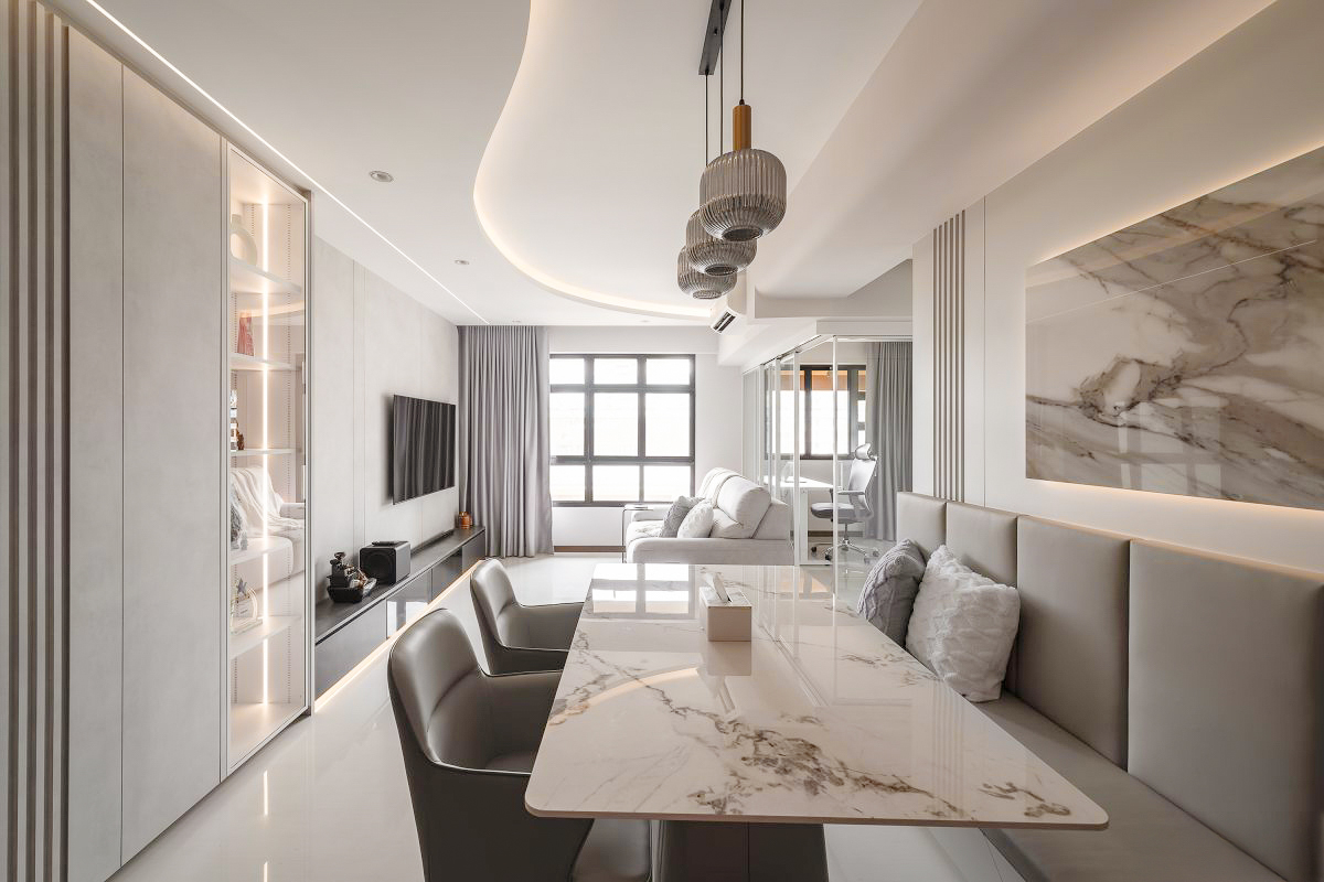
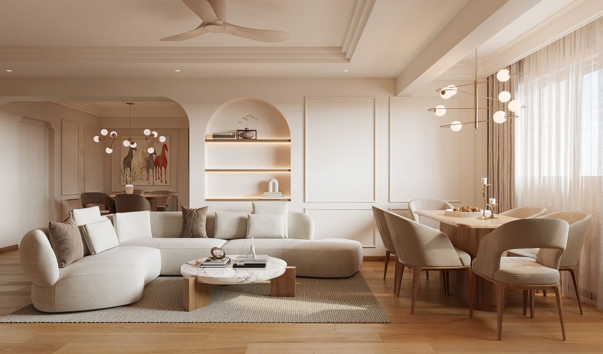
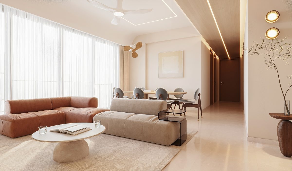
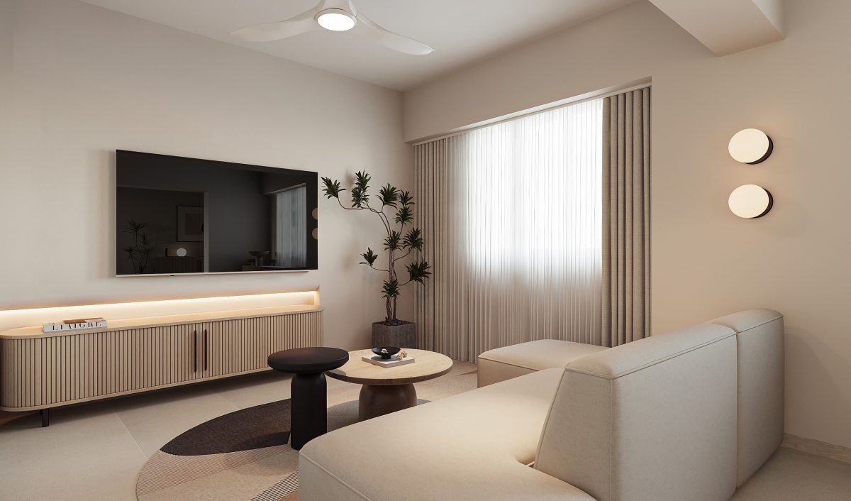
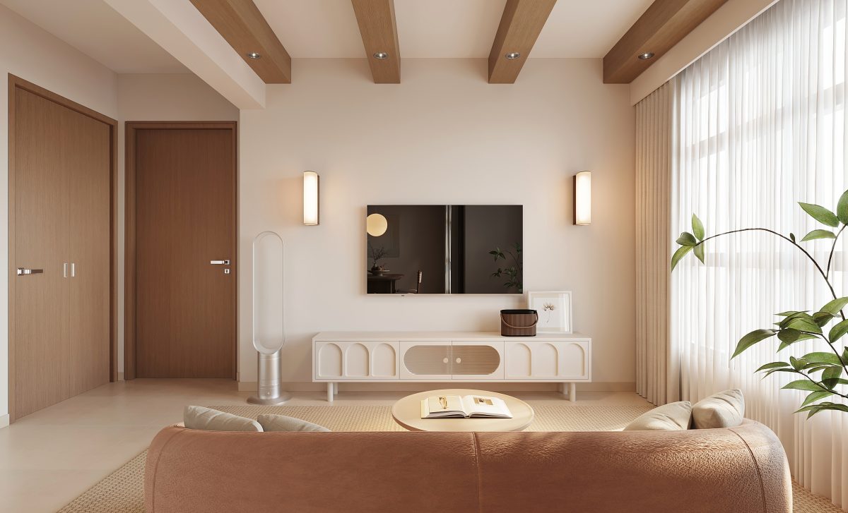
We offer a comprehensive, end-to-end service for interior design and home renovation in Singapore. Whether you're renovating your HDB, BTO, Condo, Landed Property, or Commercial Space, our award-winning interior designers work closely with you to bring your vision to life, down to the finest detail. From space planning and materials selection to project management and handover, we make the renovation journey seamless, stress-free, and satisfying.
Award Winning Interior Design
As a highly acclaimed, award-winning interior design firm, Weiken is not only trusted by thousands of homeowners and businesses in Singapore, but also aspires to become Asia’s most preferred home interior brand. We stay ahead of the curve by constantly innovating and aligning our work with the latest design trends and sustainability standards. Our customised interior design packages are competitively priced, adaptable to your needs, and thoughtfully created to deliver both beauty and practicality, within your timeline and budget.
Best Quotation. Outstanding Workmanship. Peace of Mind.
Recognised as a reliable and reputable renovation company in Singapore, Weiken is committed to offering transparent pricing, superior craftsmanship, and end-to-end support. We collaborate closely with our clients to ensure that every project is a true reflection of their vision.
Reliable Support,
Even After Completion
Reliable support, even after completion through our dedicated "We Care" department, we ensure clear communication and responsive after-sales service. From addressing customer feedback to managing post-renovation repairs, we prioritize long-term satisfaction. All our renovation and interior design works come with a 2-year warranty, a testament to our confidence and commitment to quality.
Our excellence is reflected in
numerous prestigious awards
BCA and HDB Builders (2011), RCMA (2018), Bizsafe STAR (2012), Nippon Paint Designers of Choice, Spirit of Enterprise (2013), Singapore Quality Brand Award (2014), SME 500 Singapore (2019/2020), Top 10 Interior Design Firms (2020, HomeRenoGuru), SuperTrust (2022 & 2023, Qanvast), SIDA Award (2022), IDEA Award (2022), Creative Color Awards (2023, Nippon Paint)


By
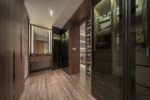
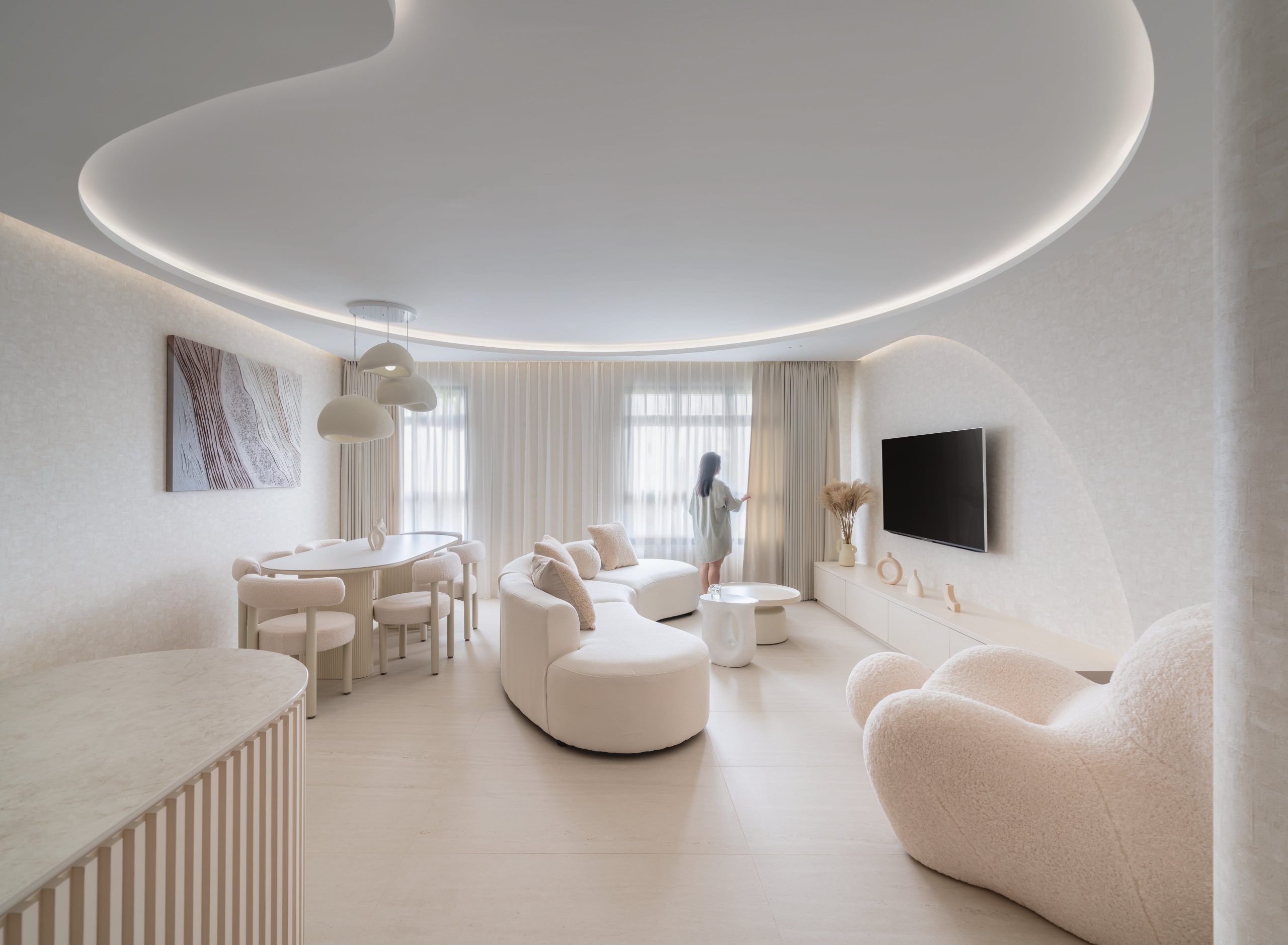
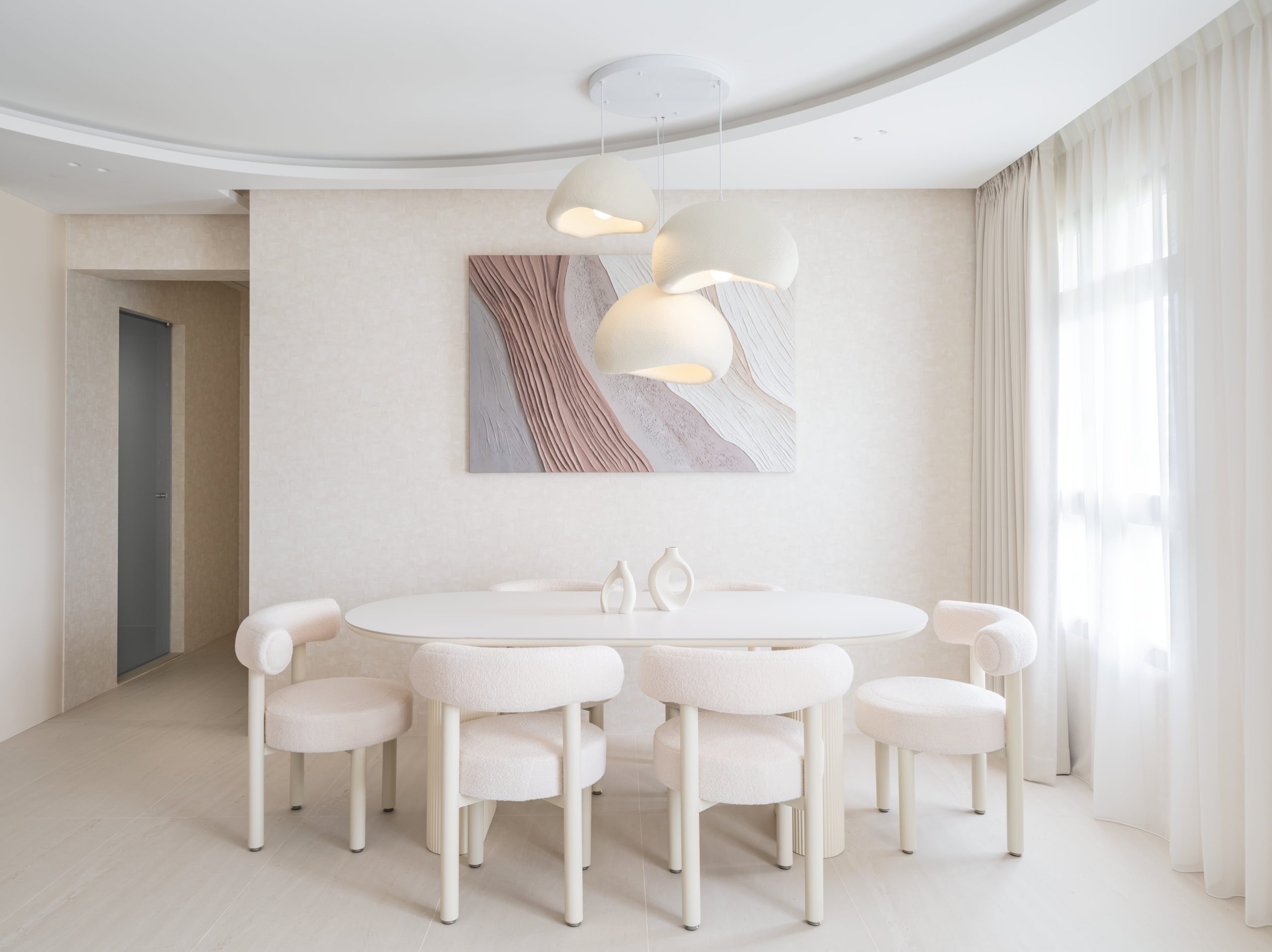
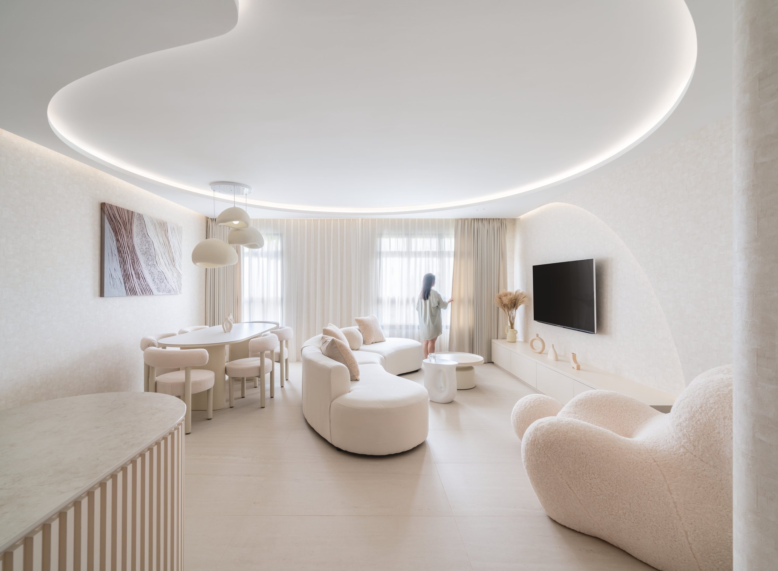
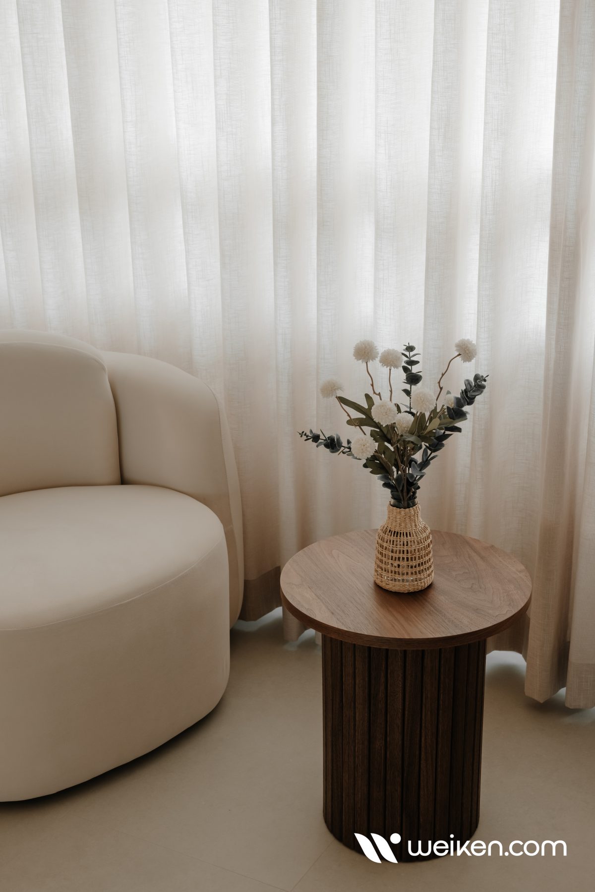
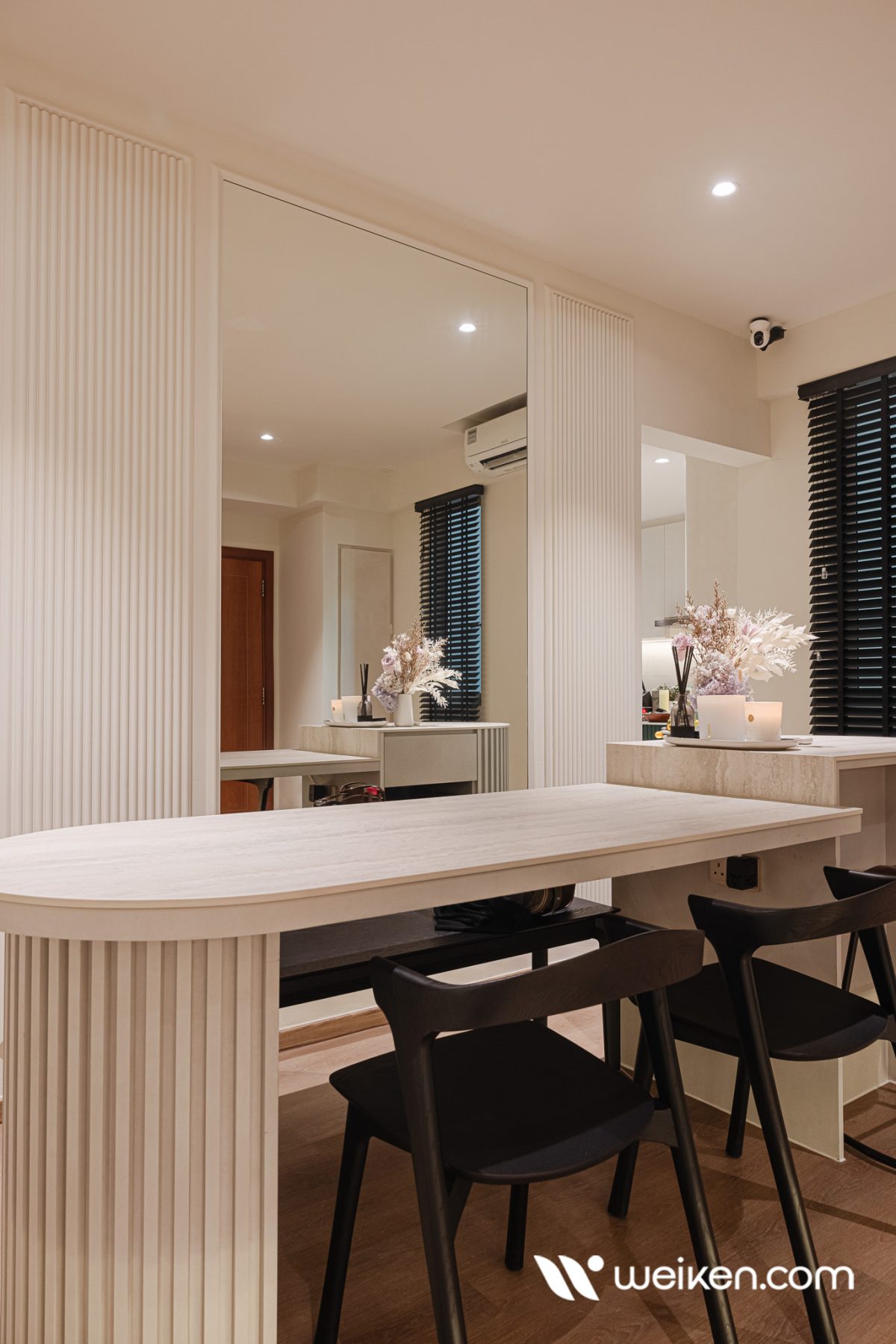
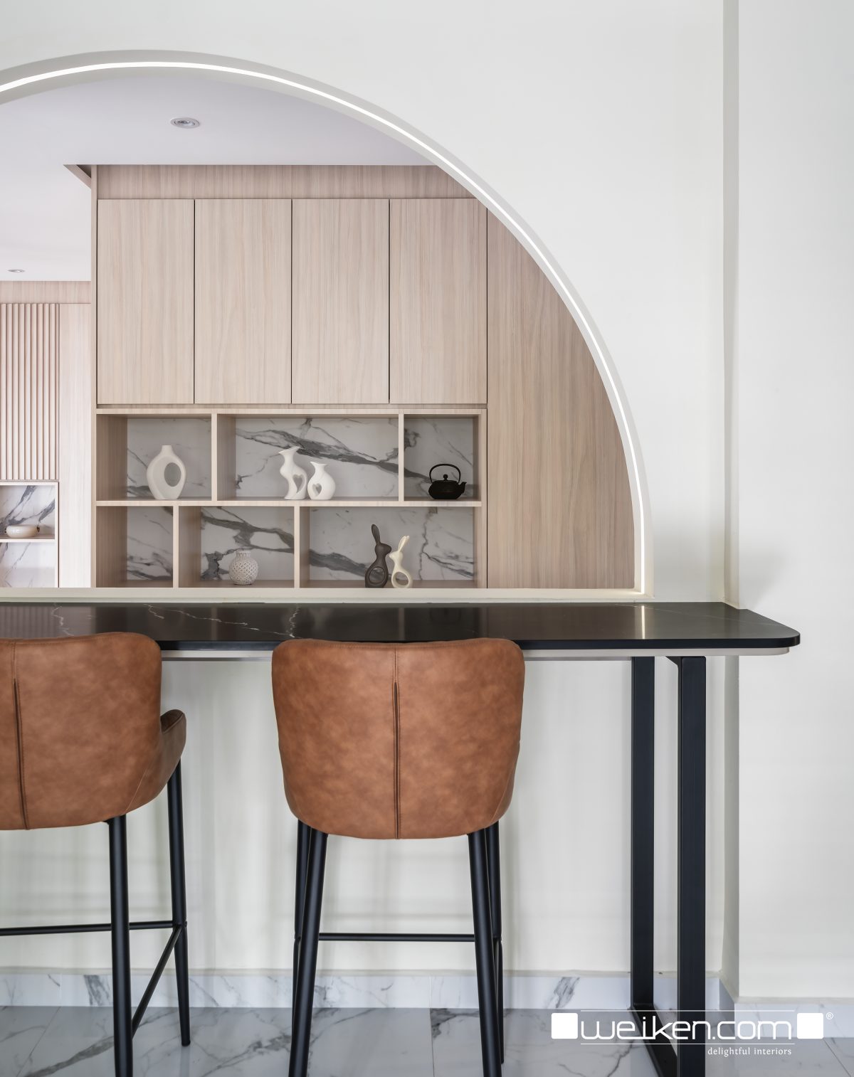
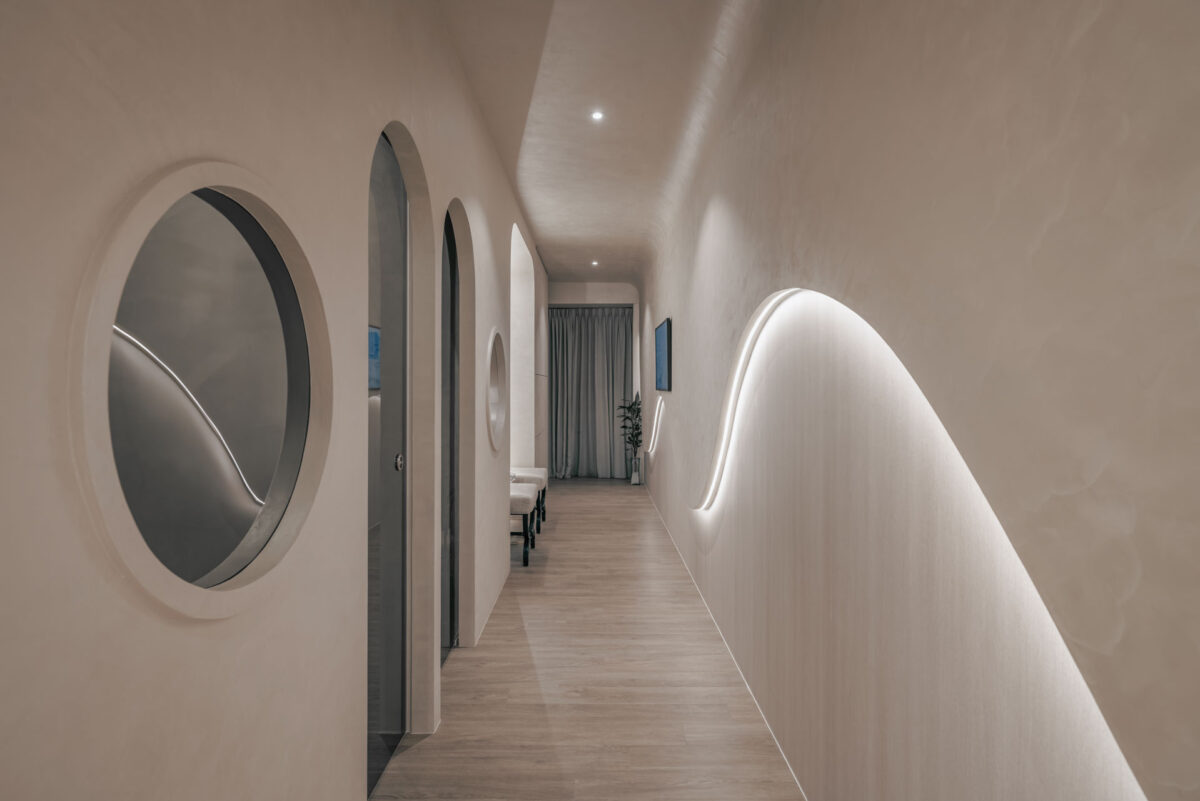
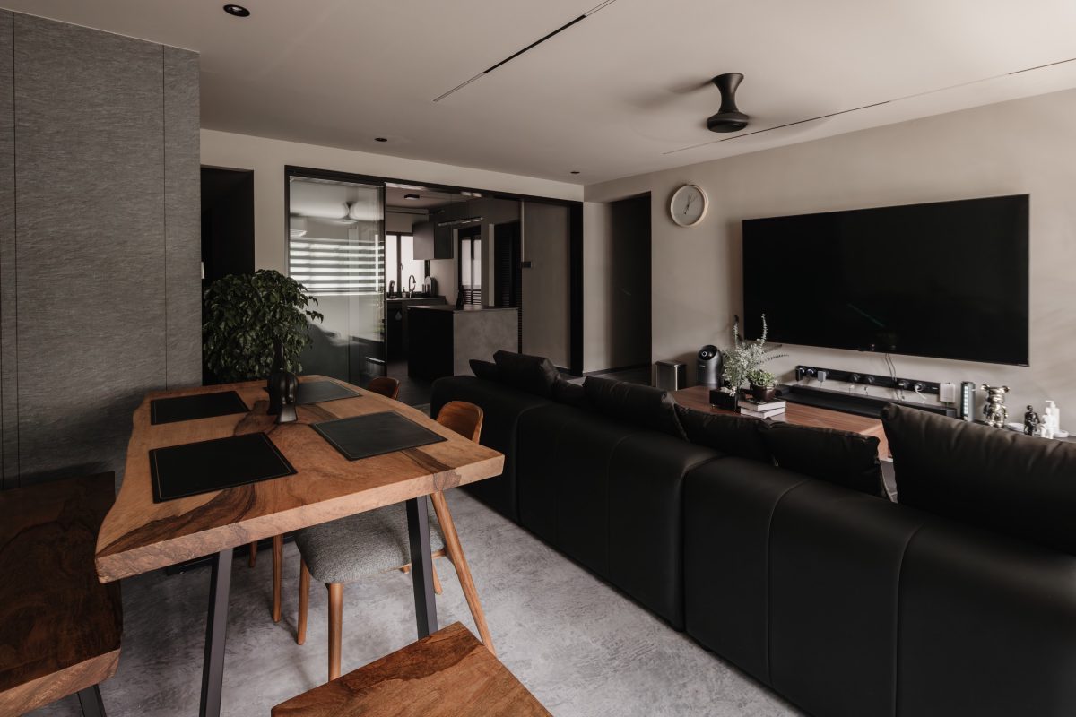
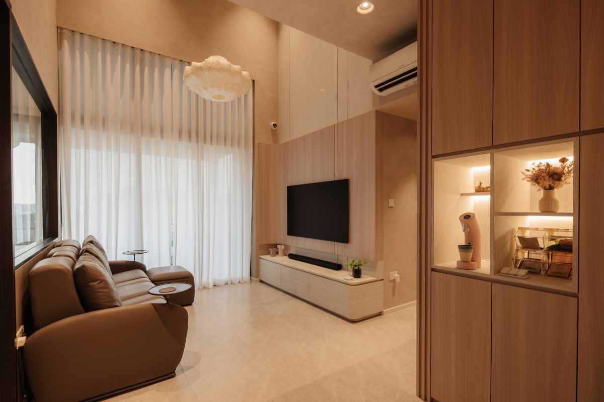
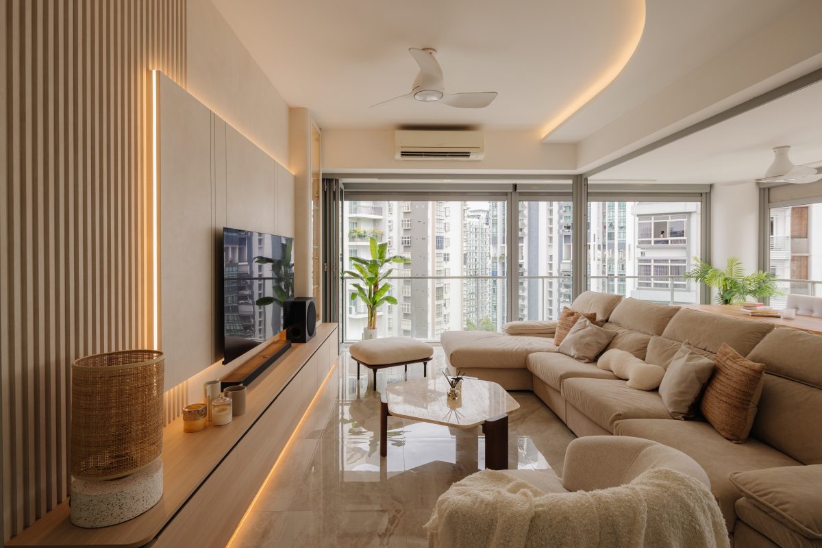
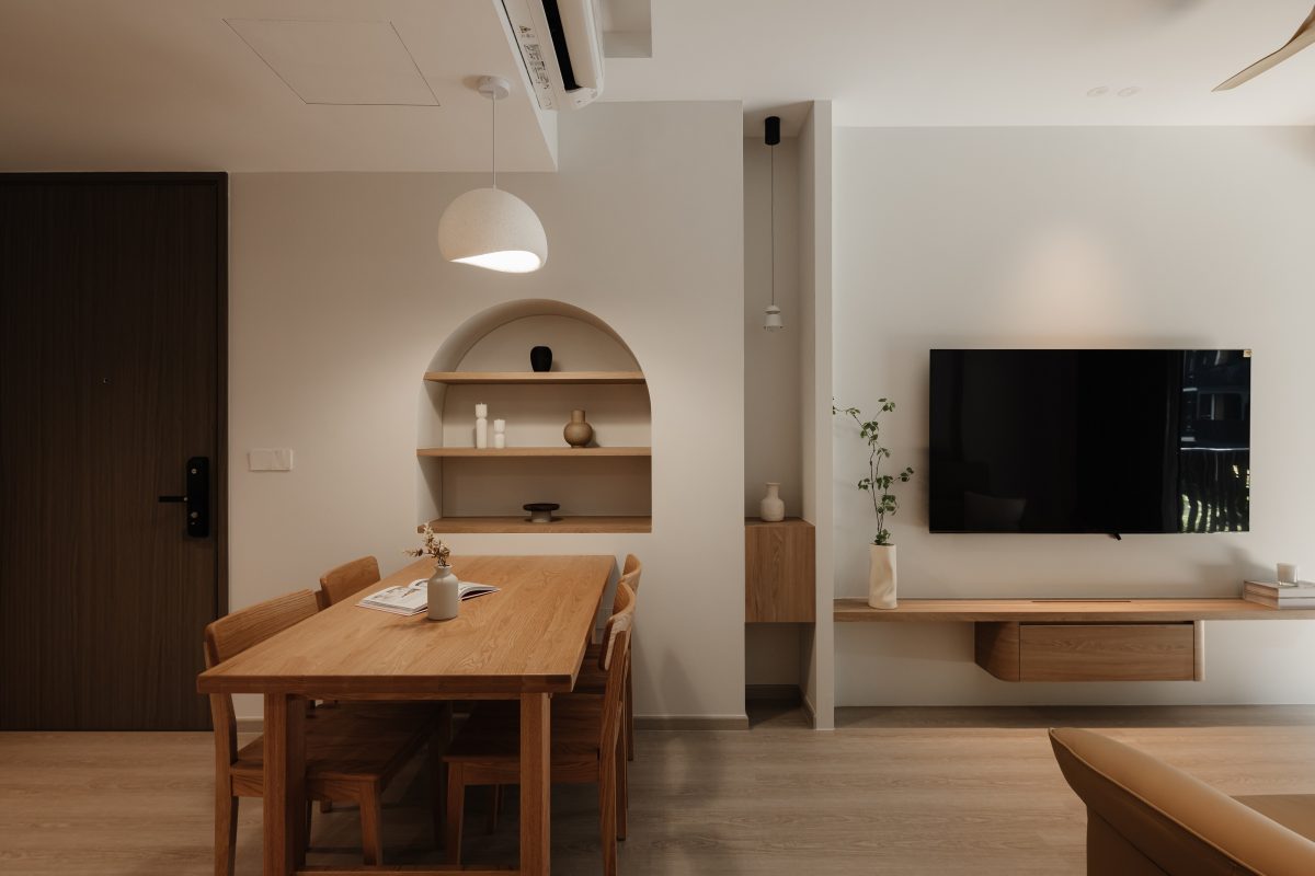
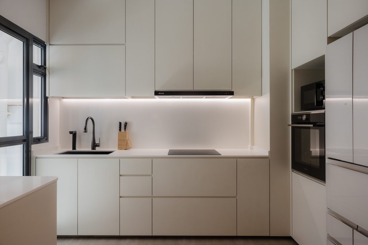
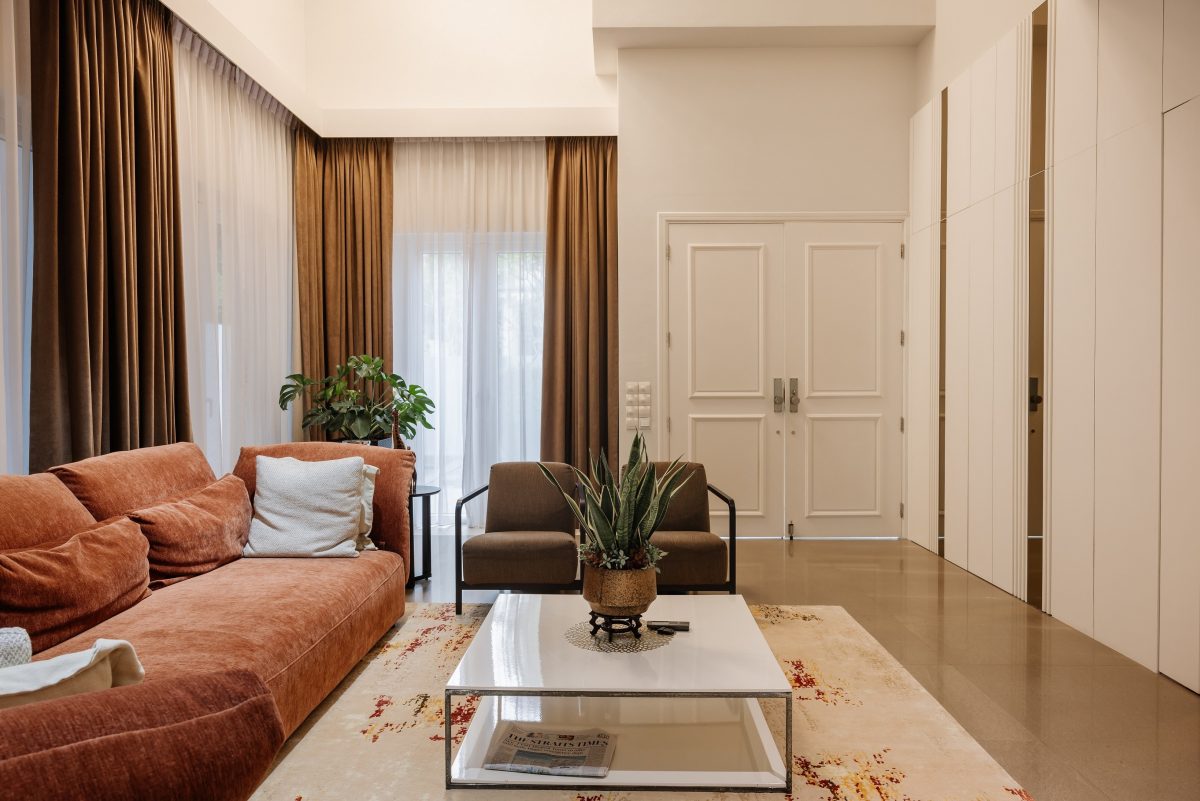
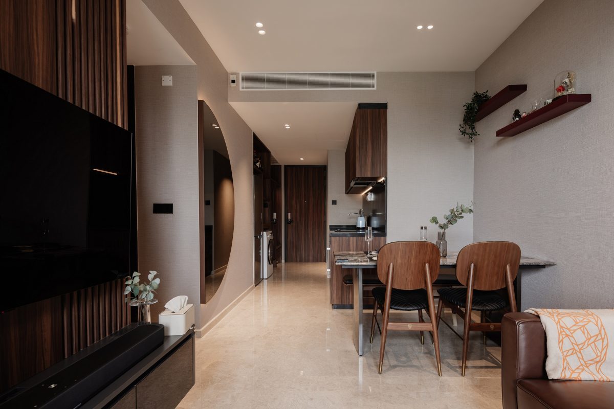
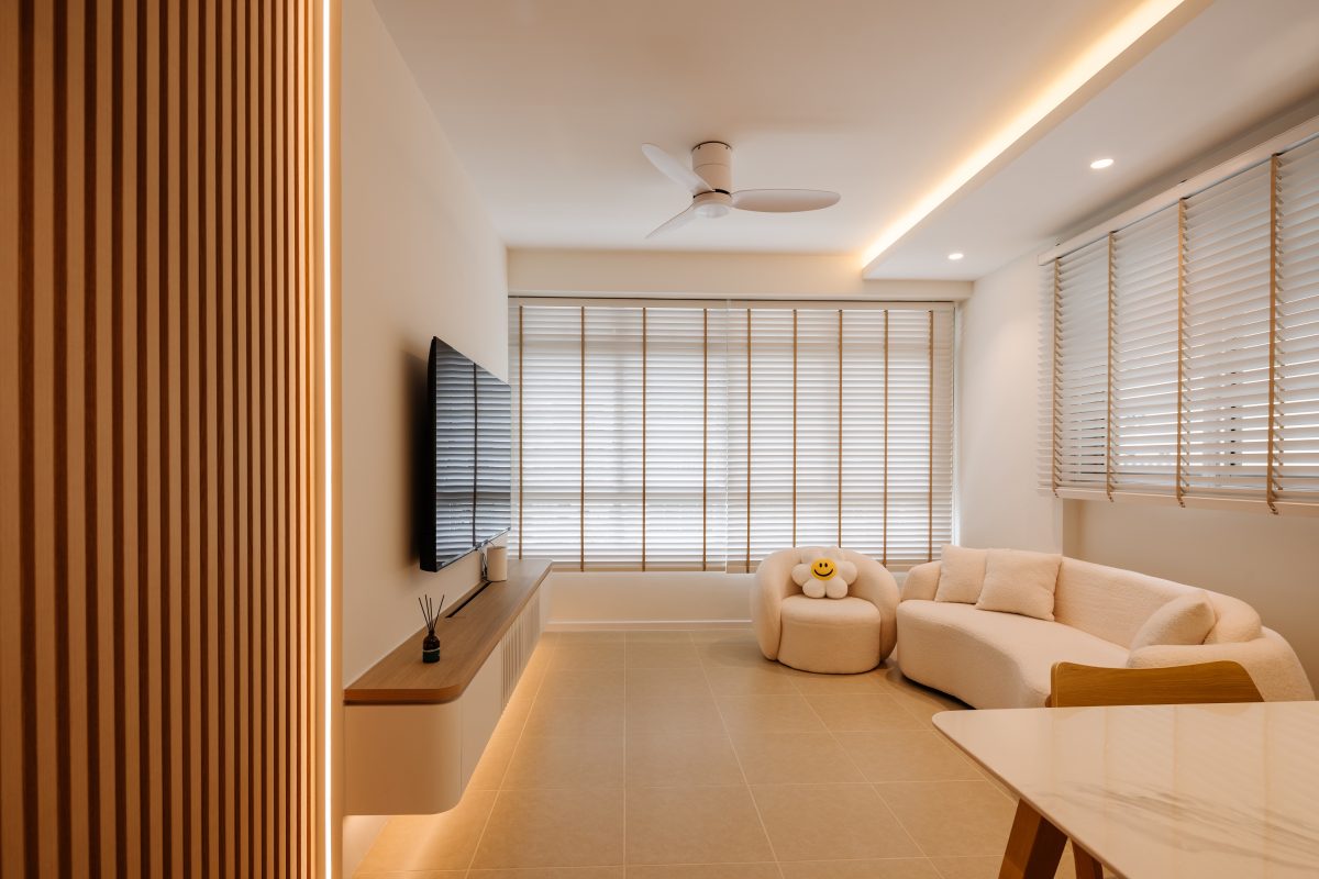
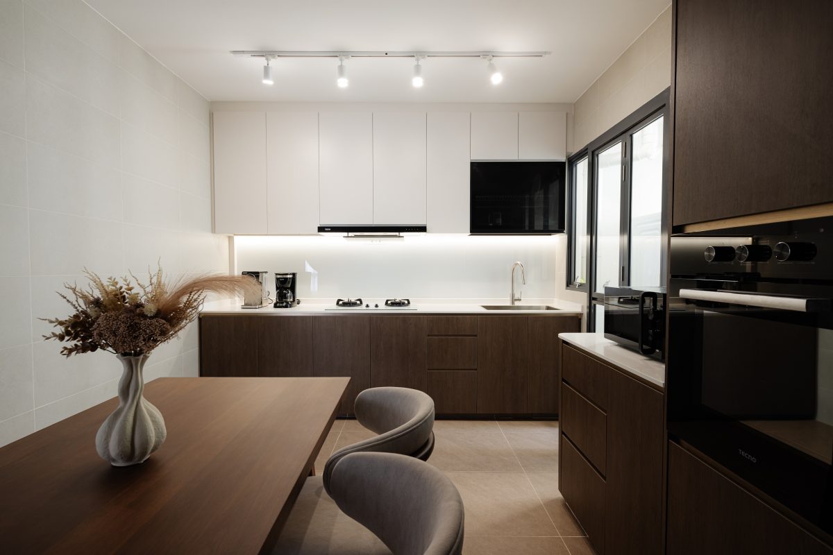
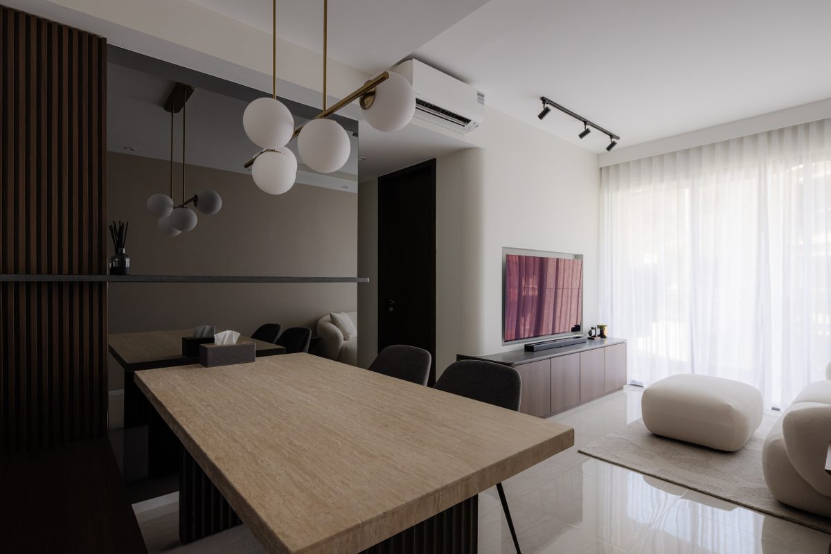
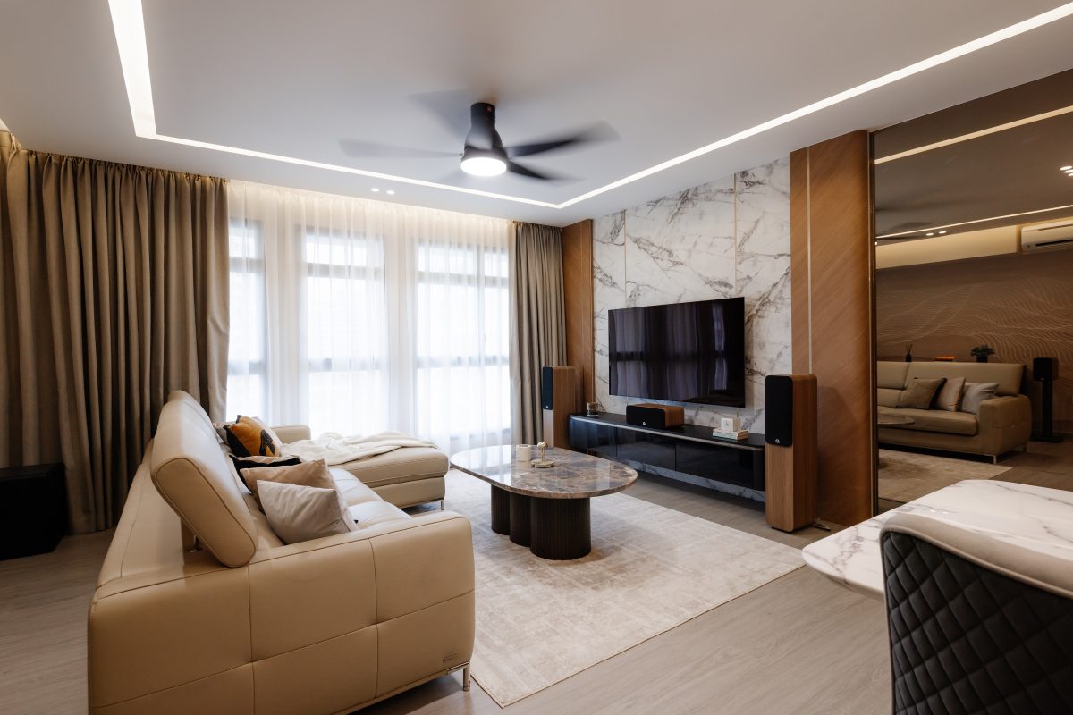
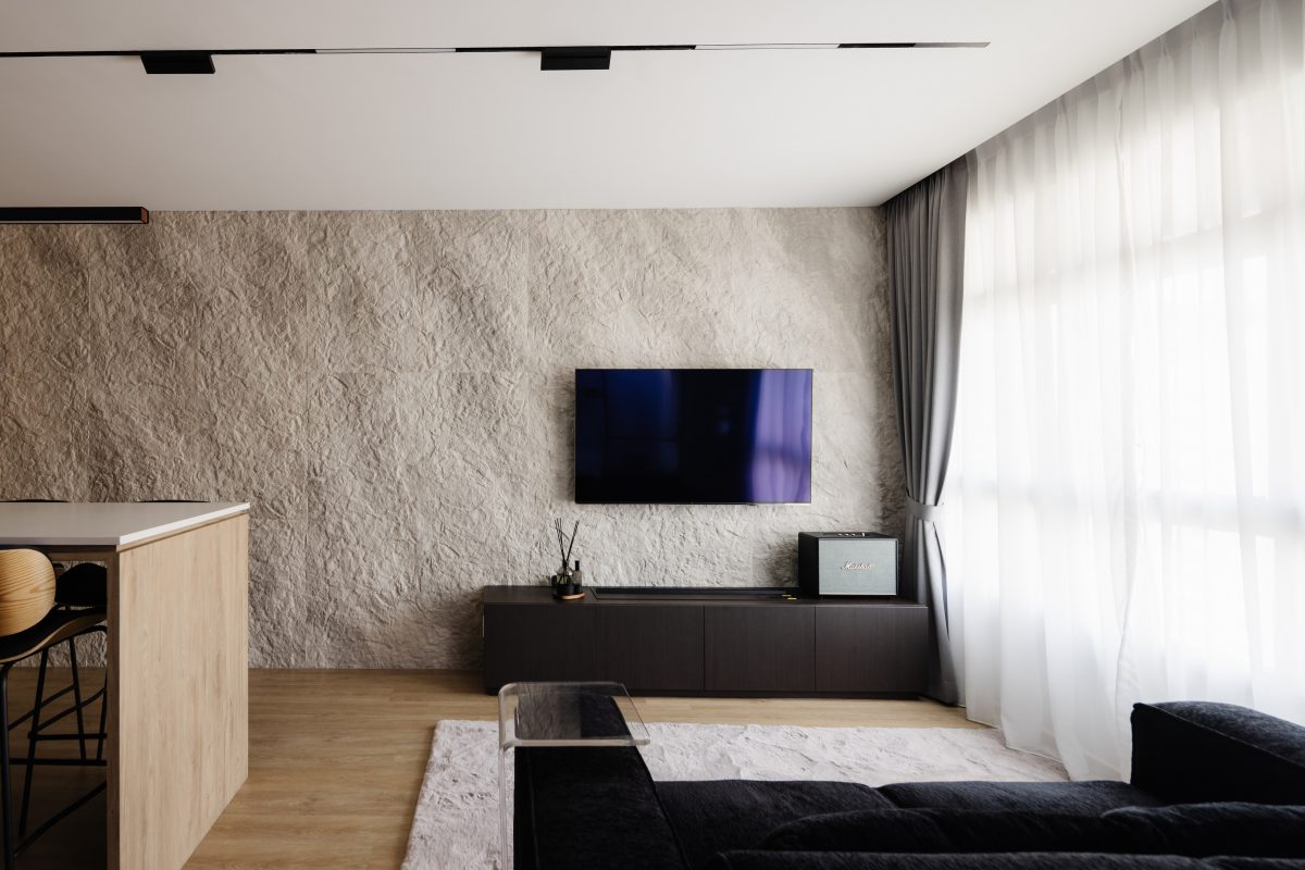
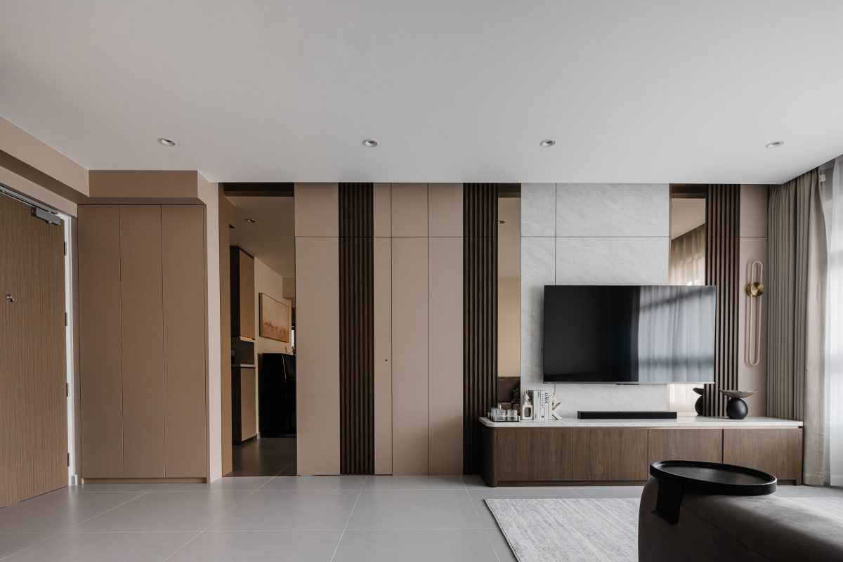
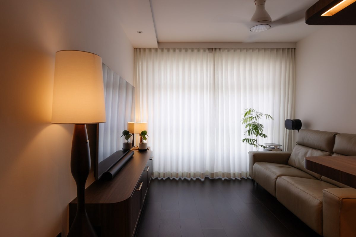
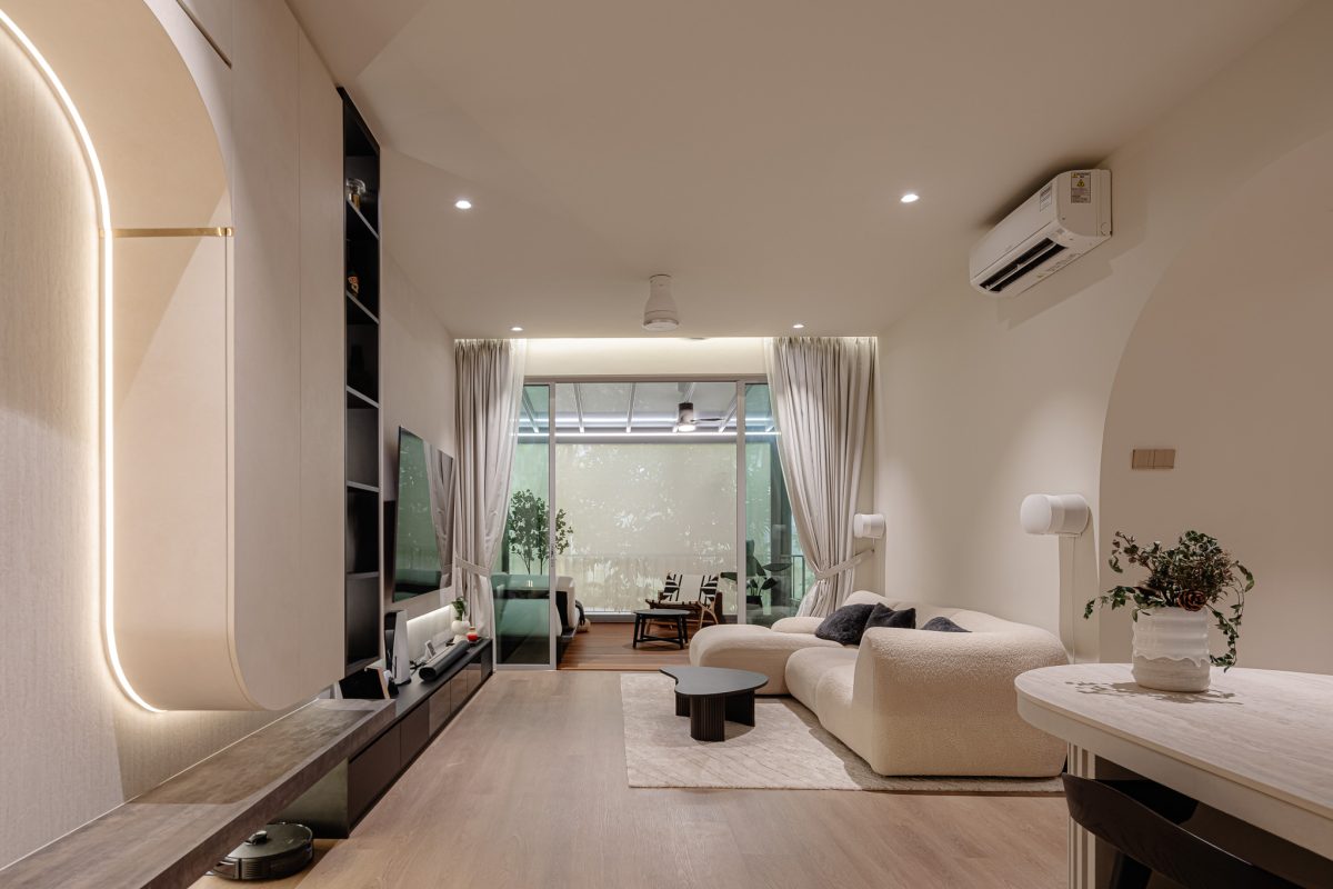
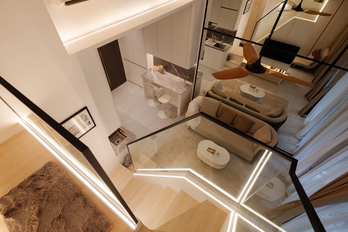
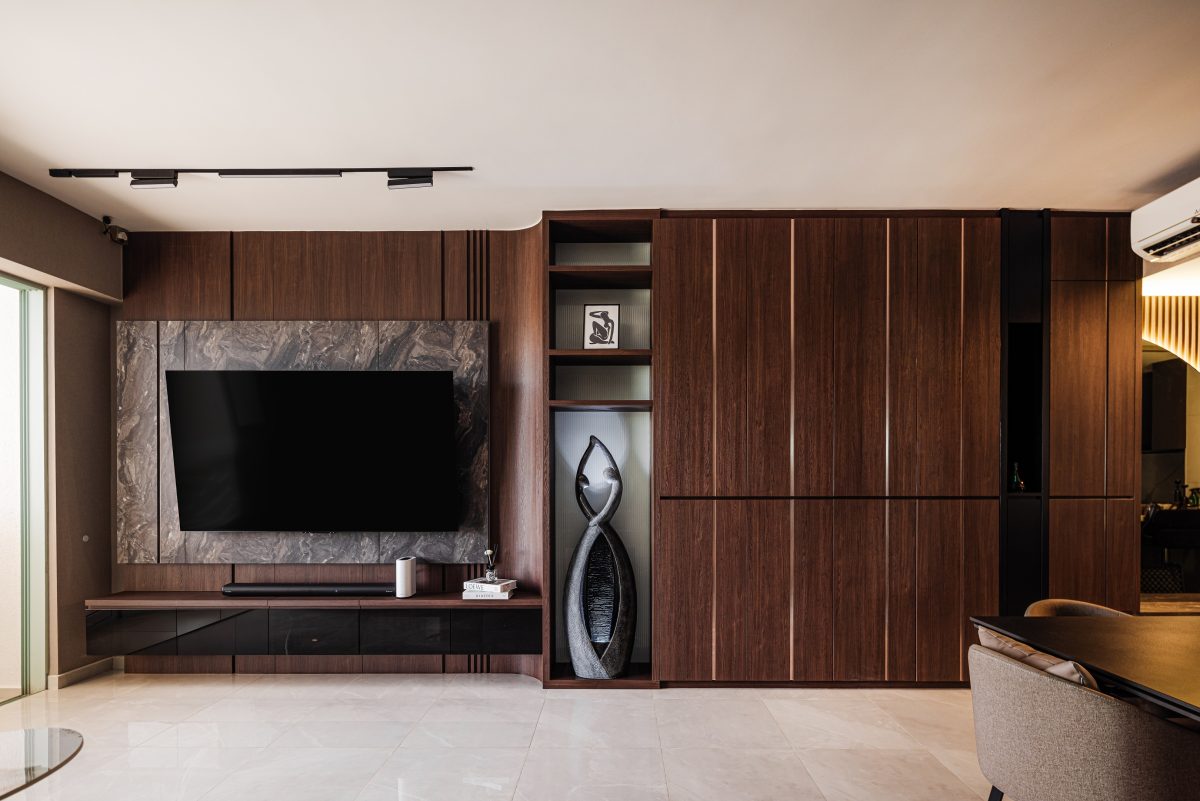
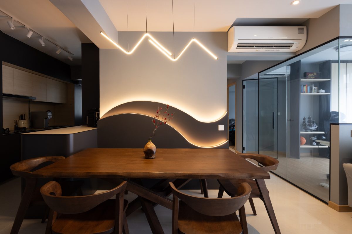
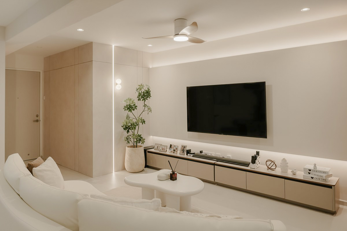
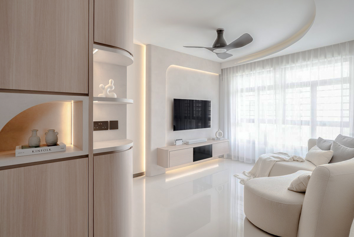
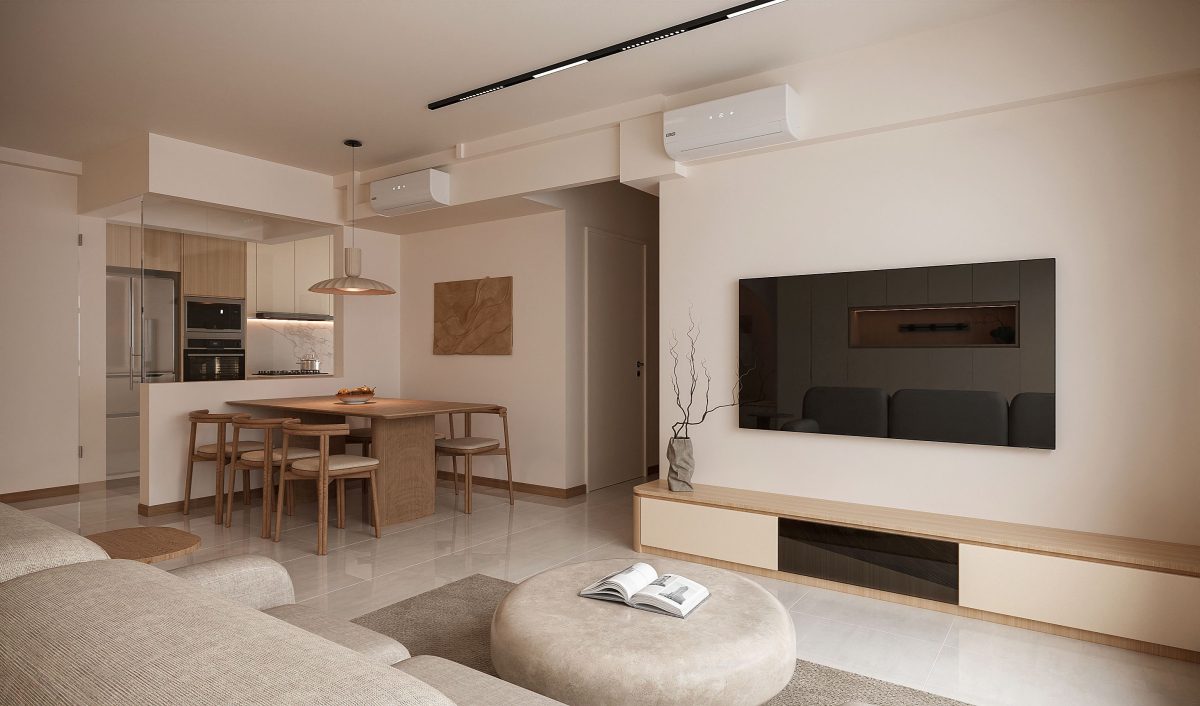
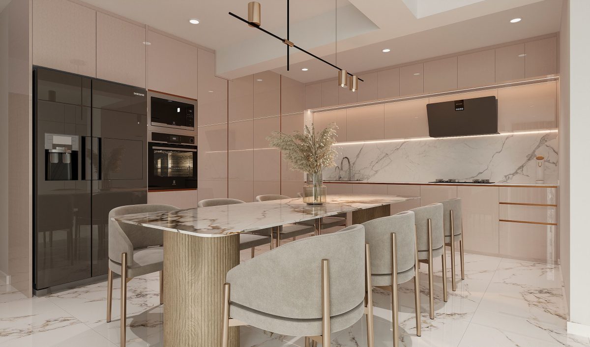
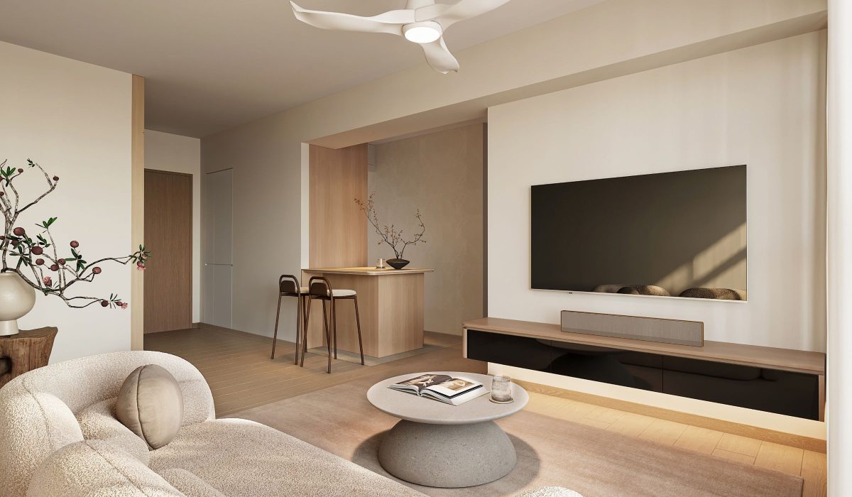
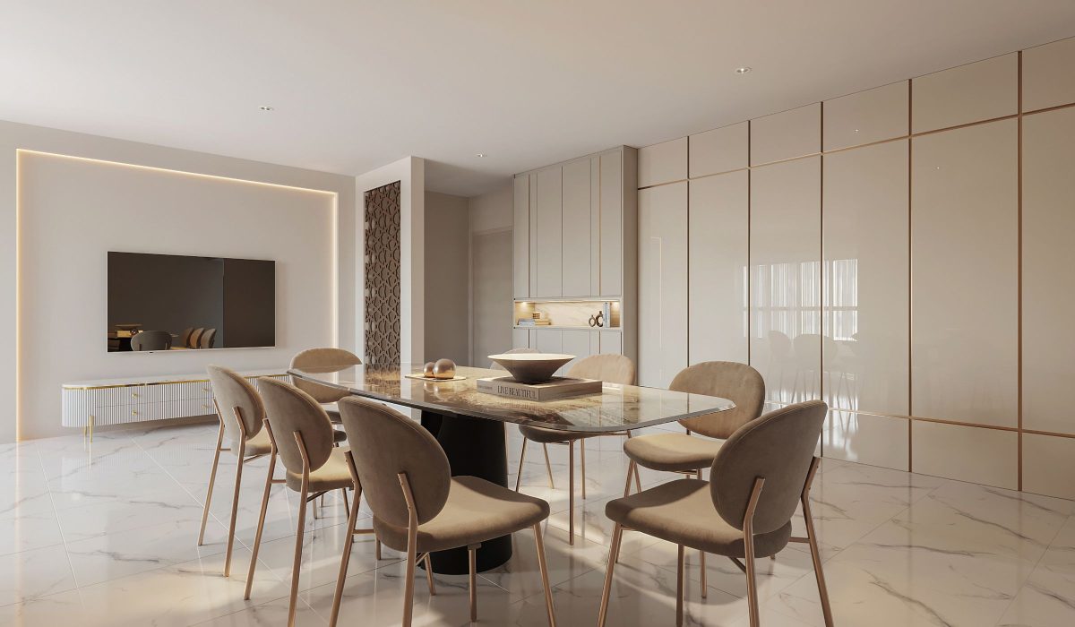
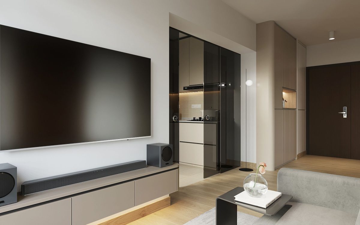
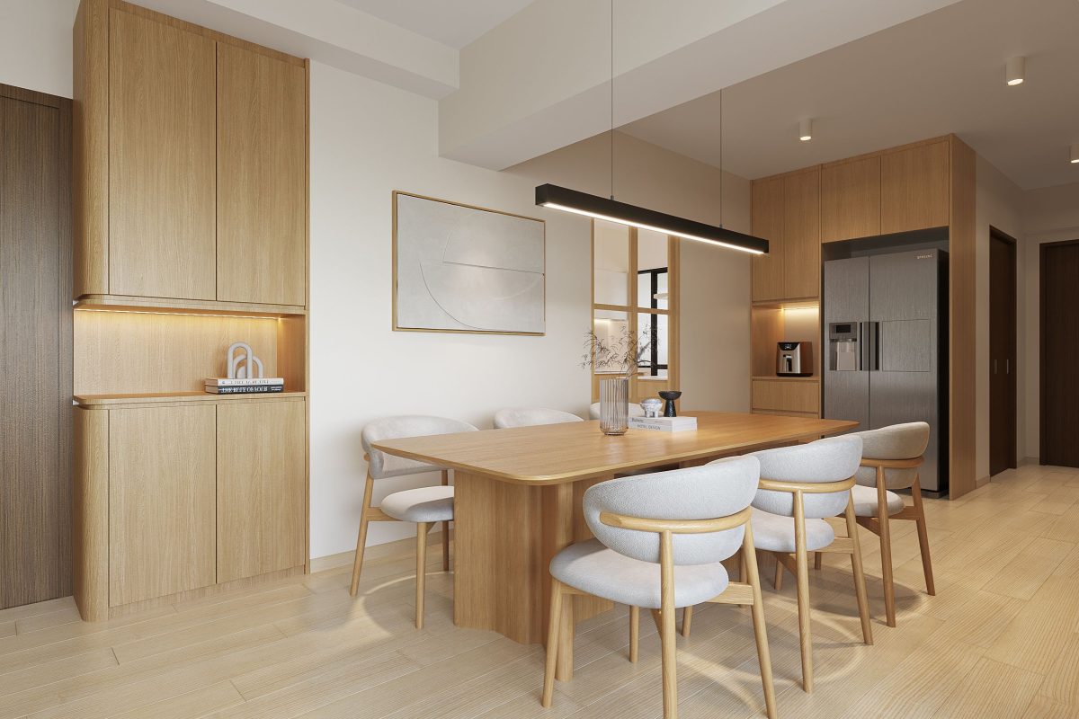
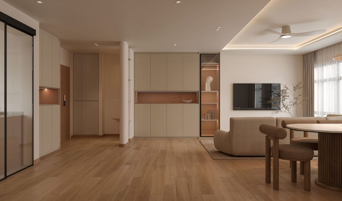
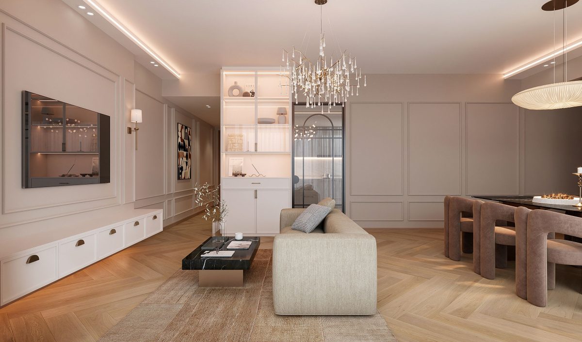
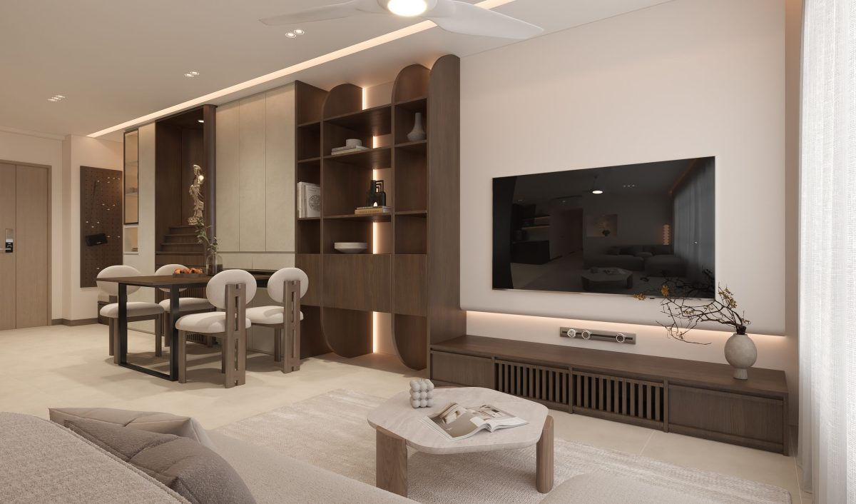
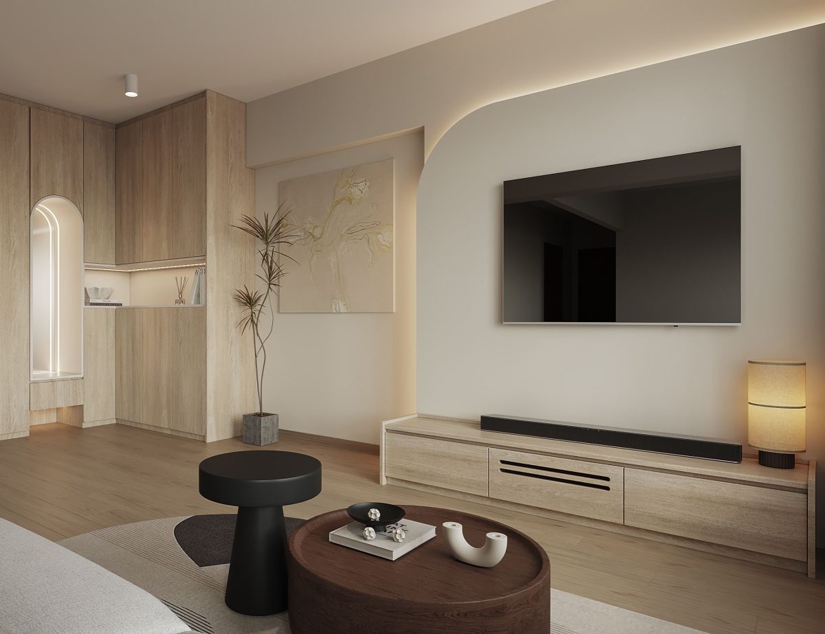
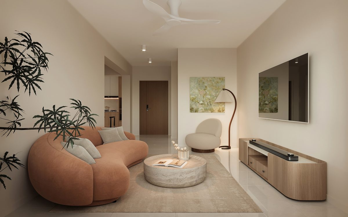
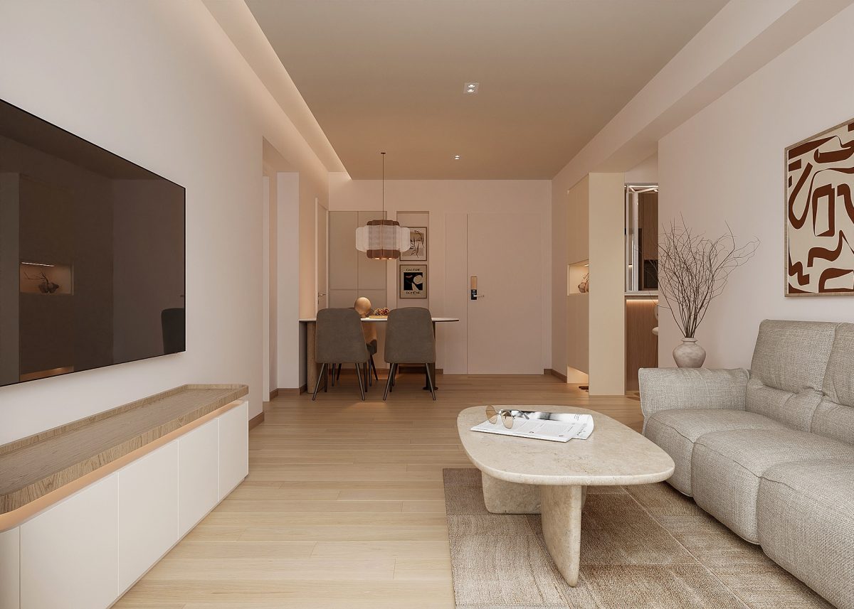
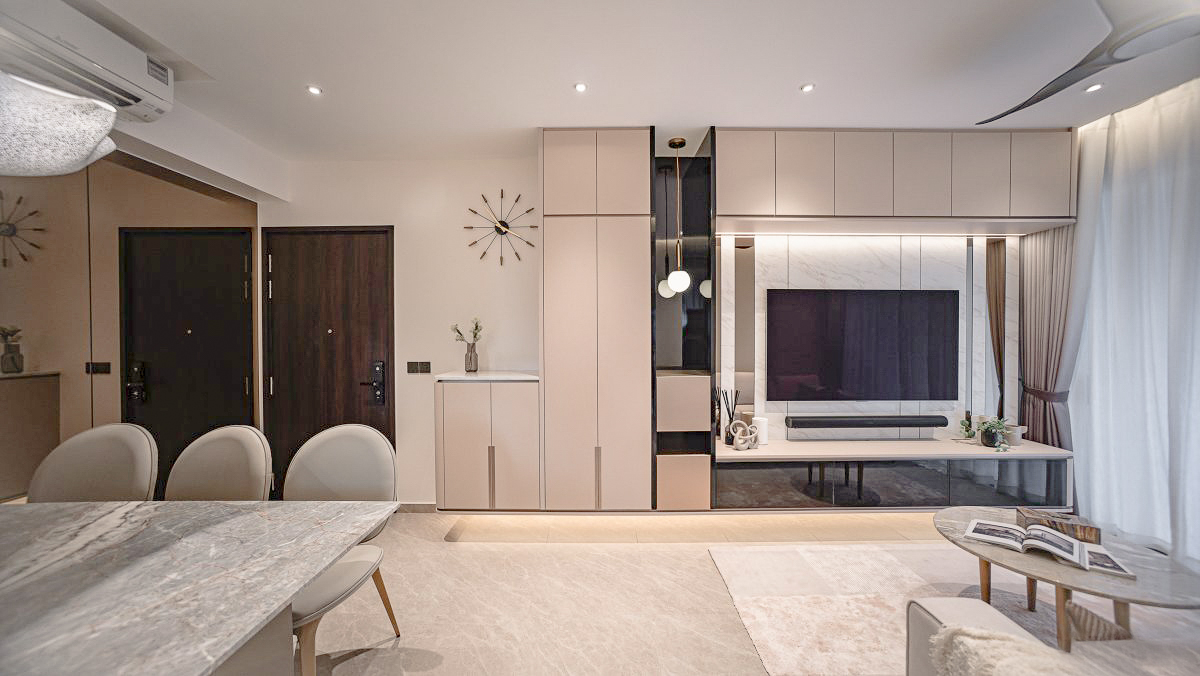
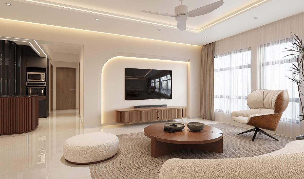
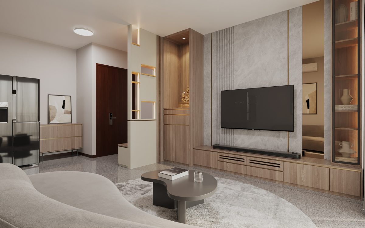
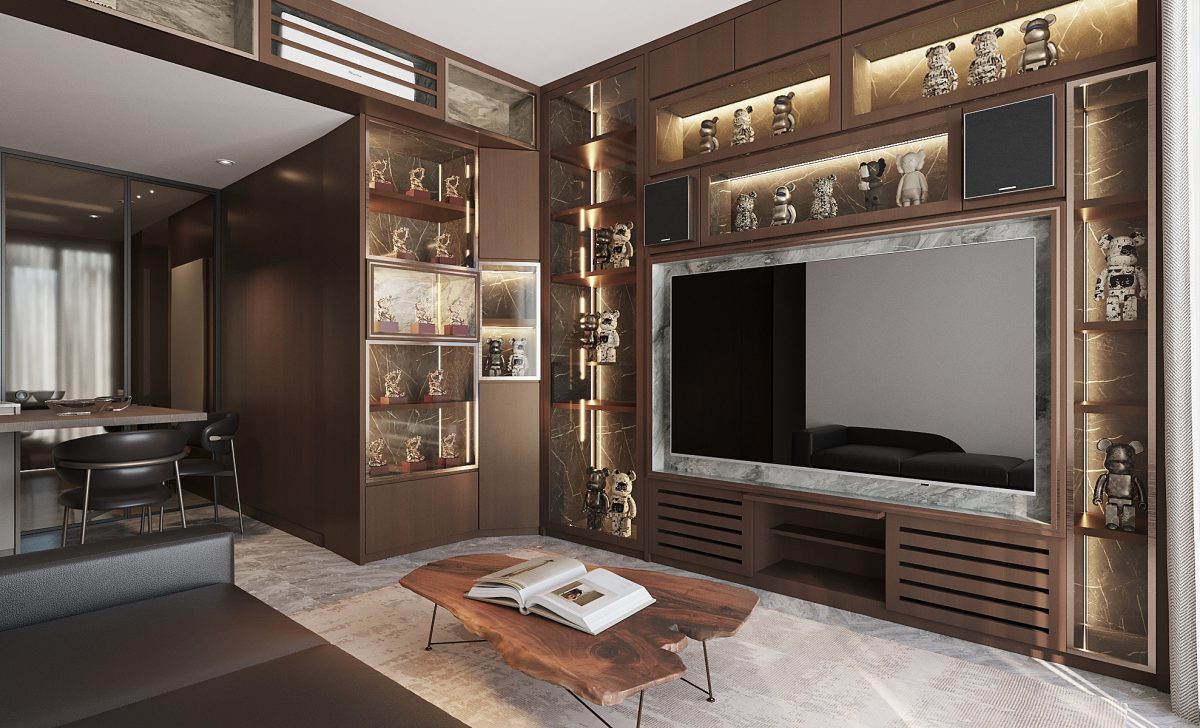
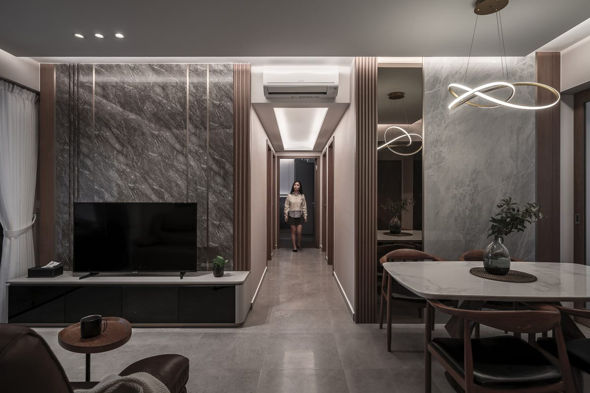
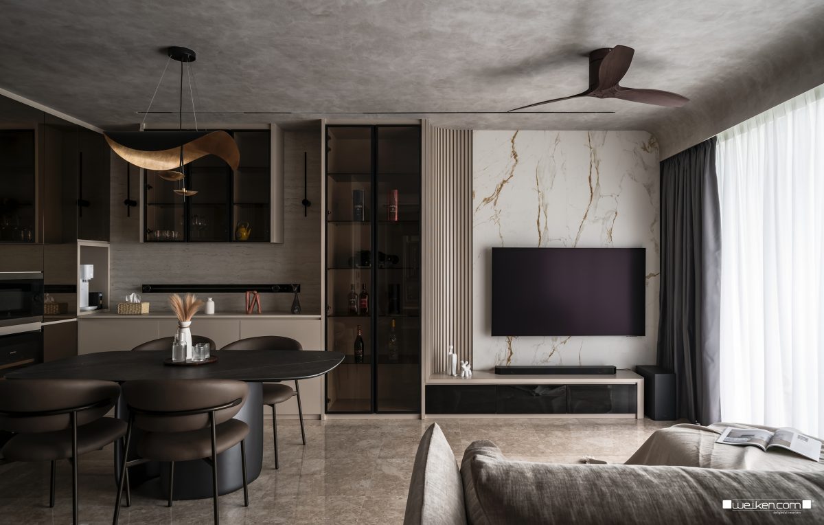
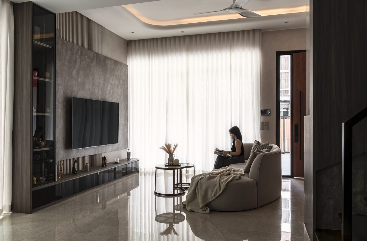
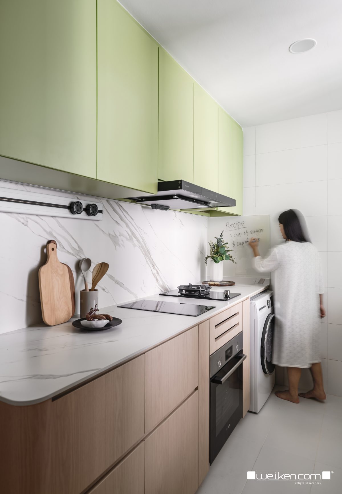
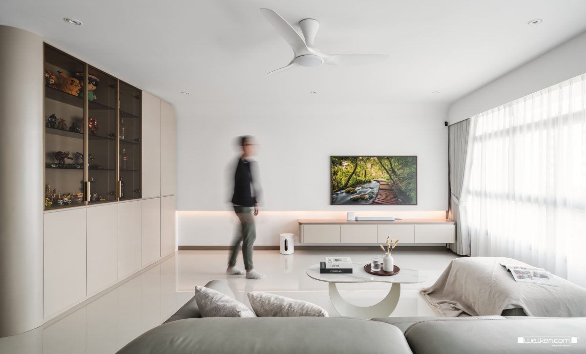
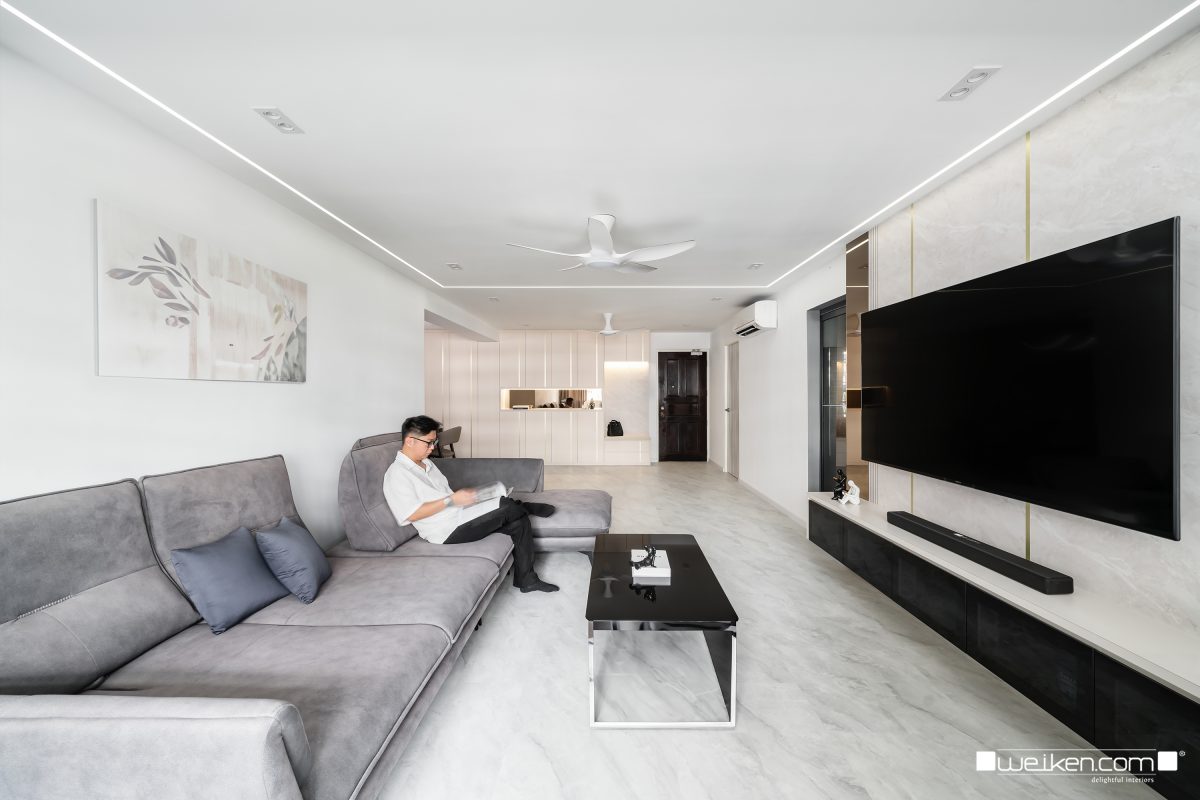
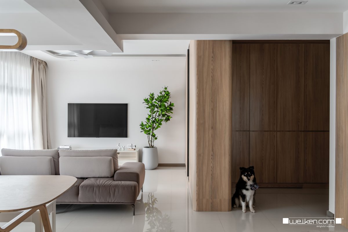
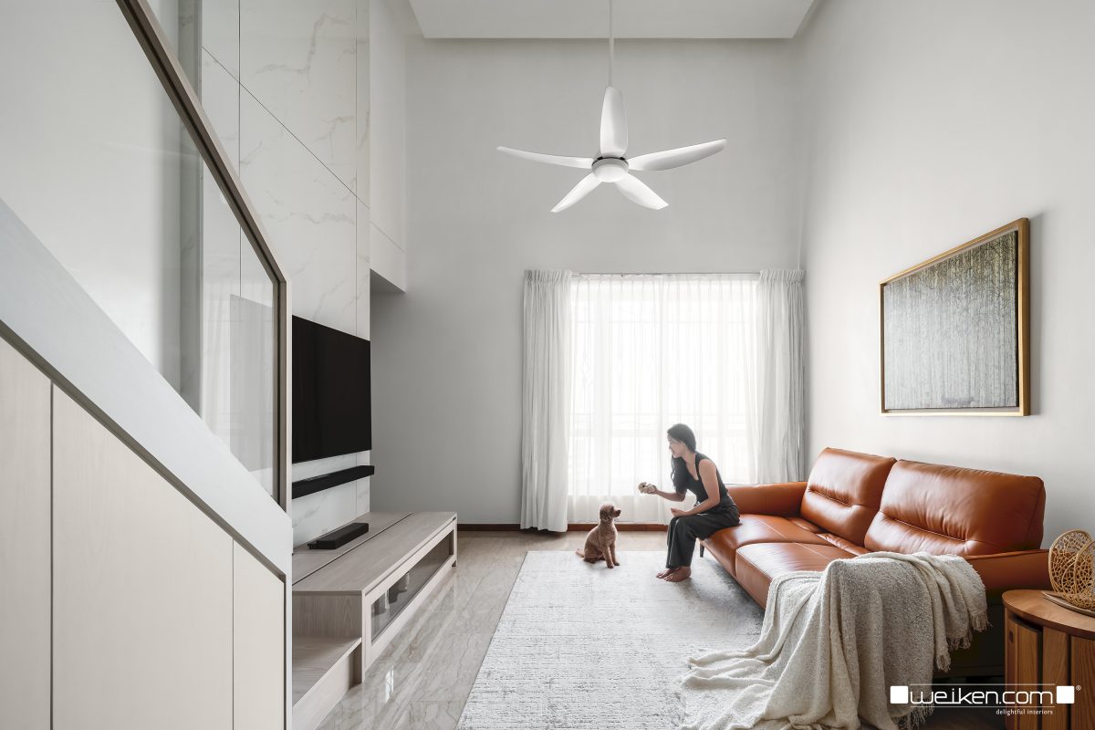
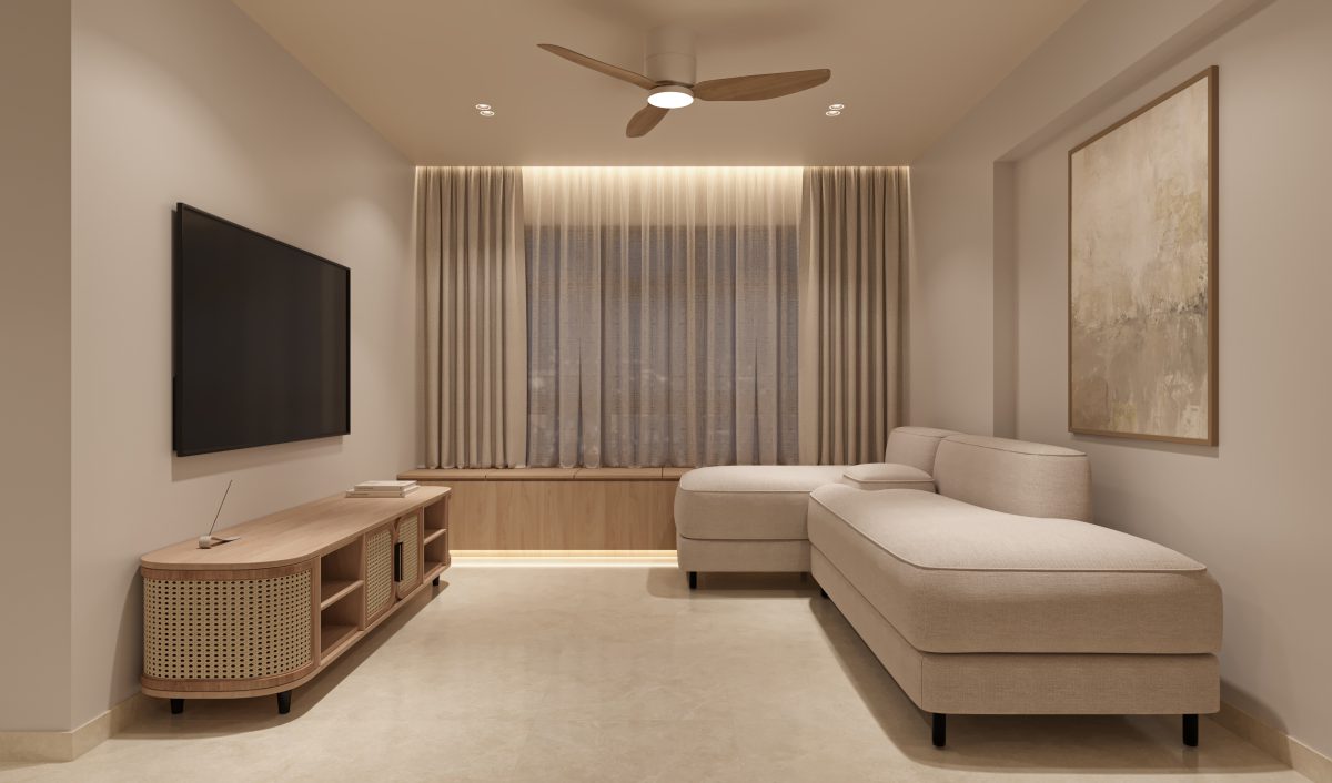
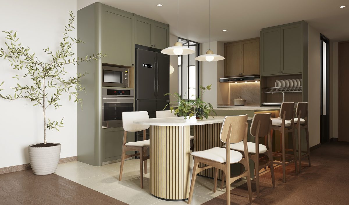
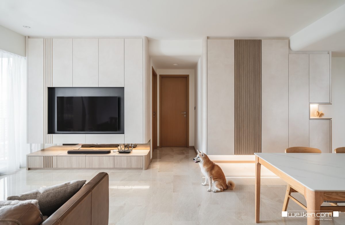
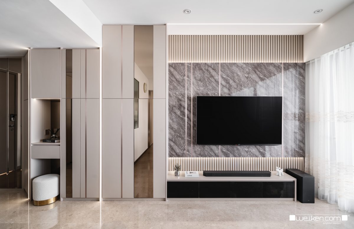
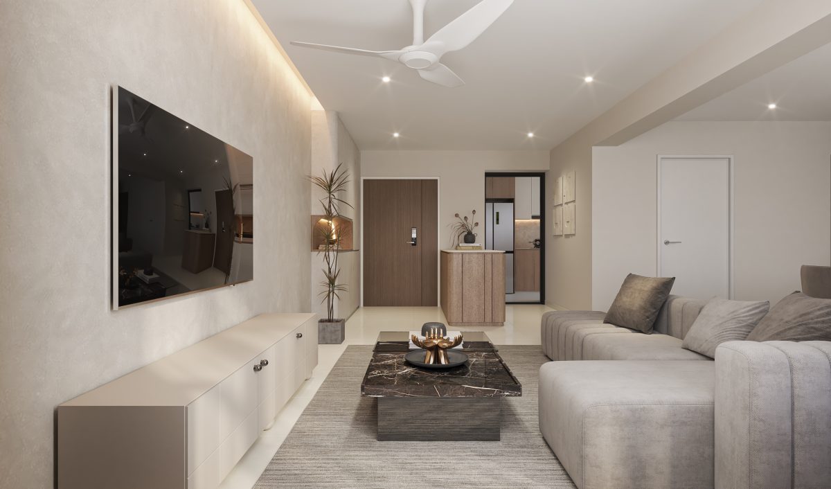
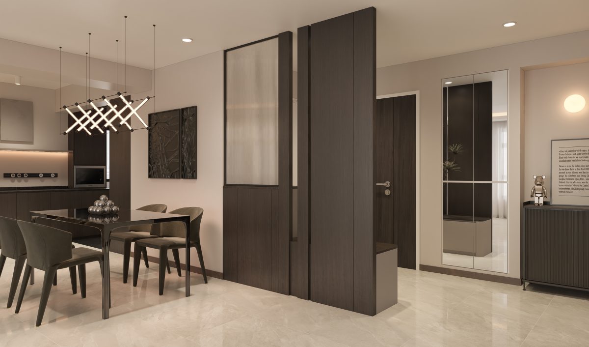
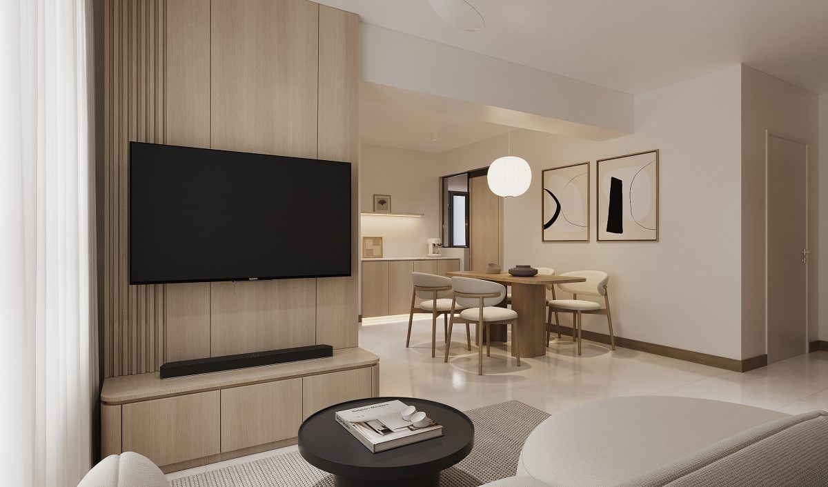
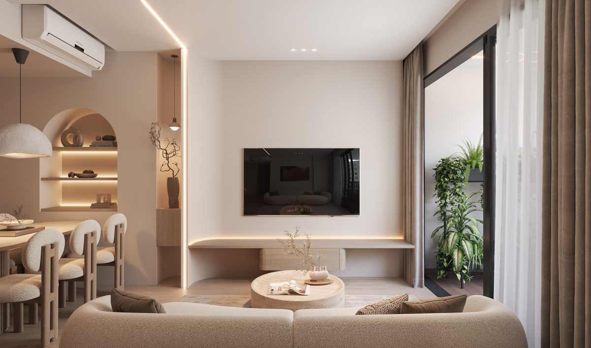
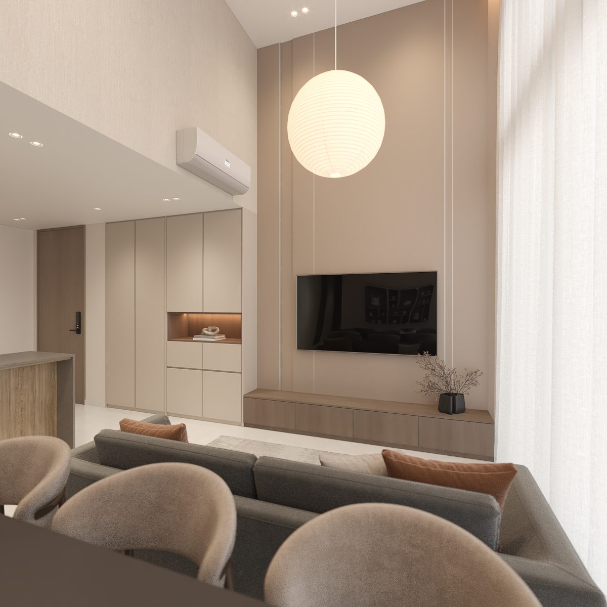
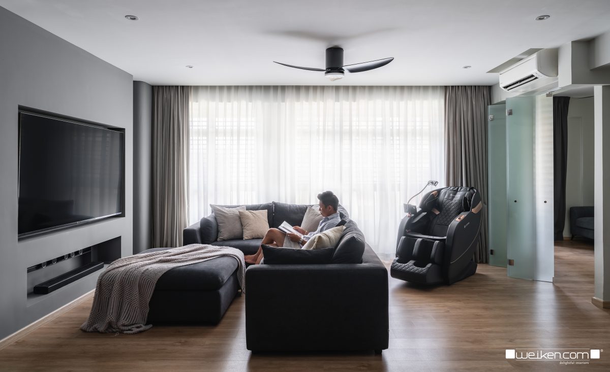
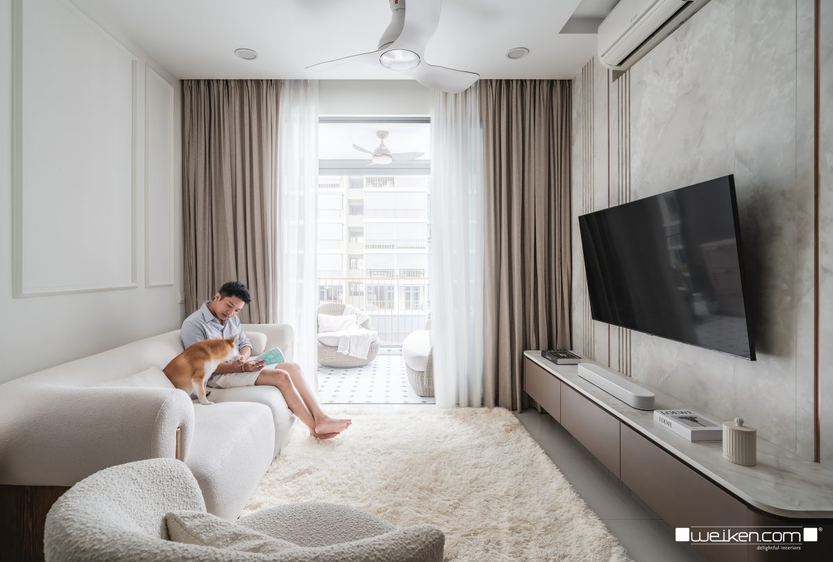
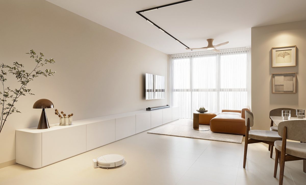
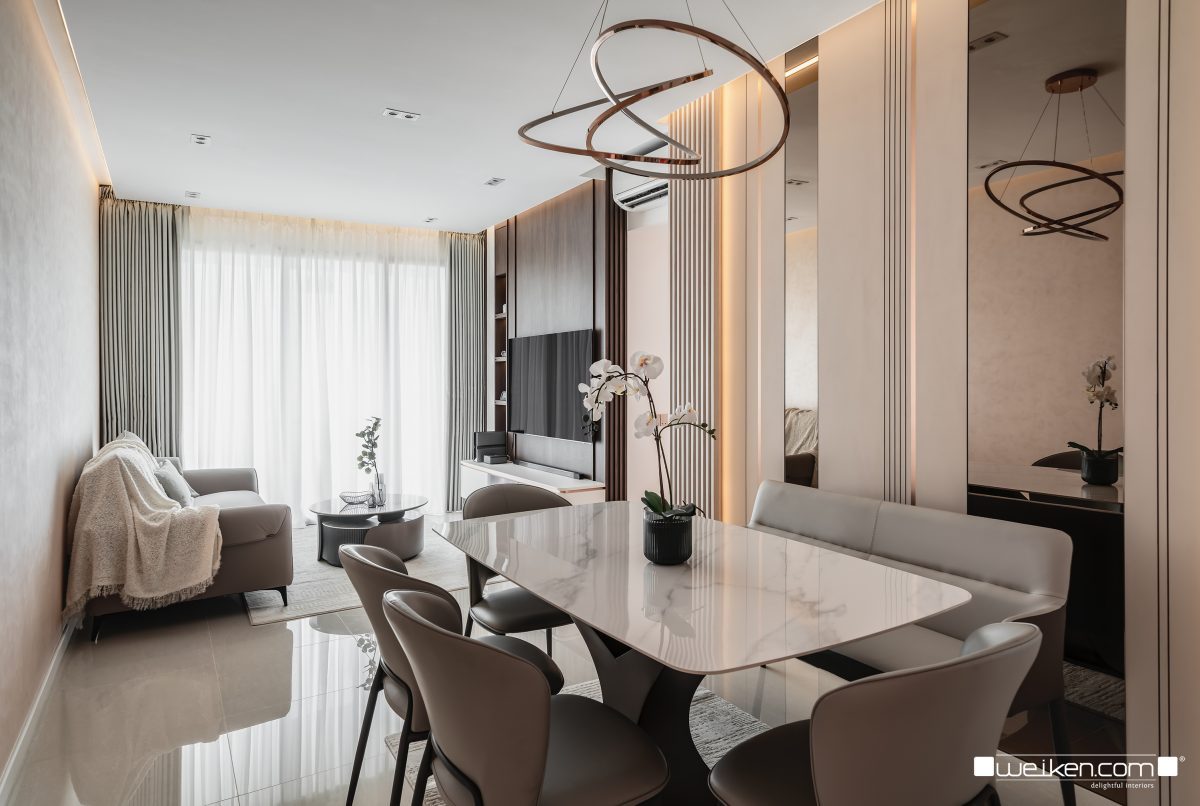
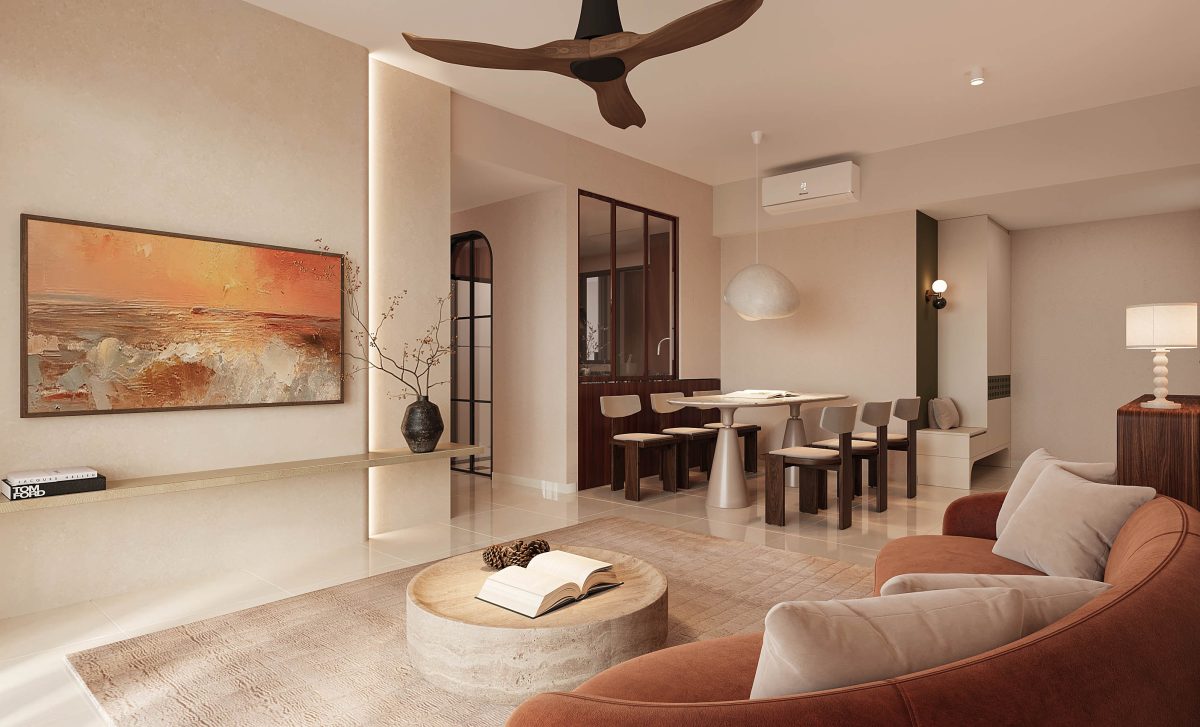
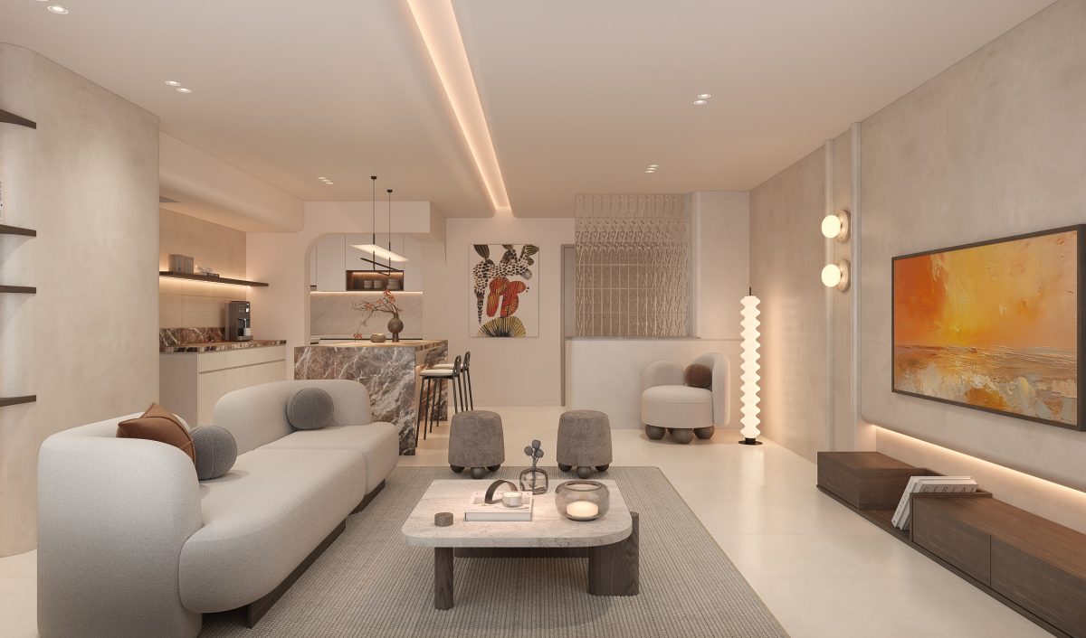
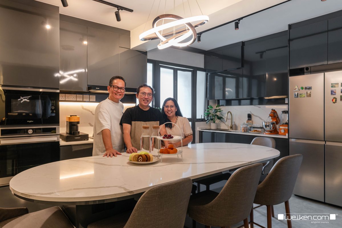
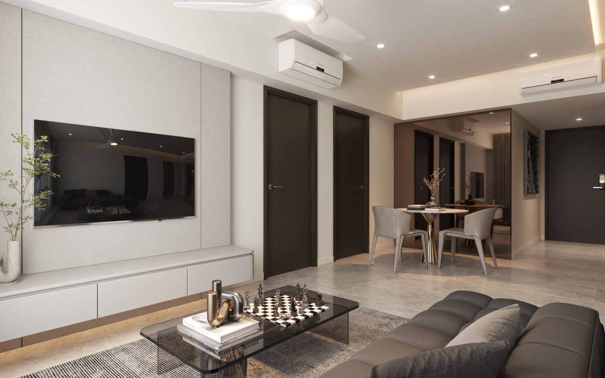
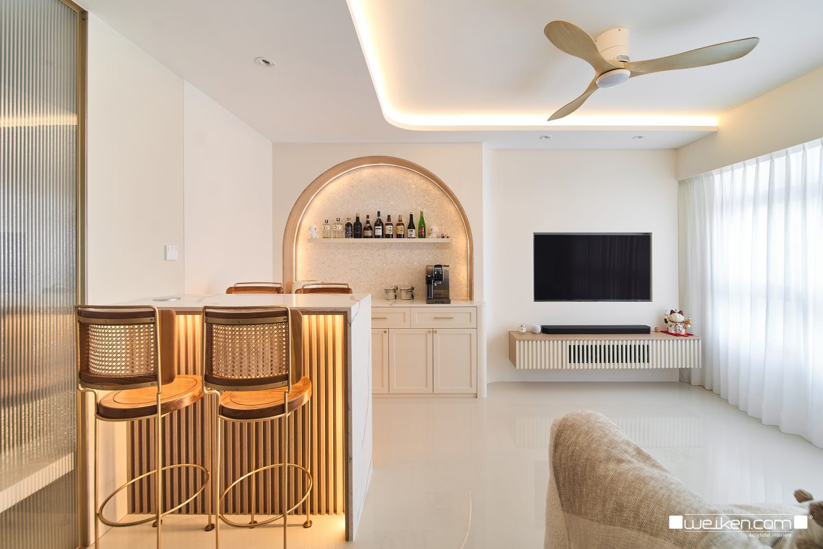
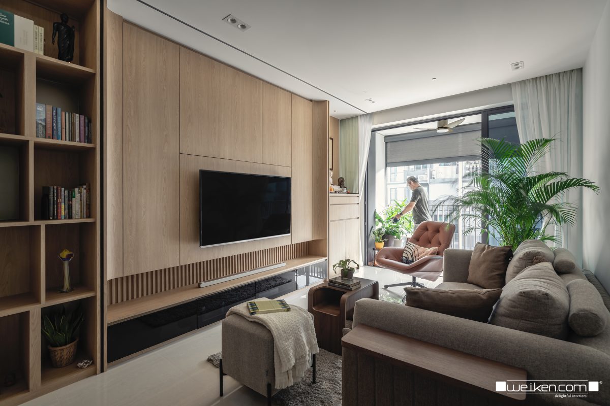
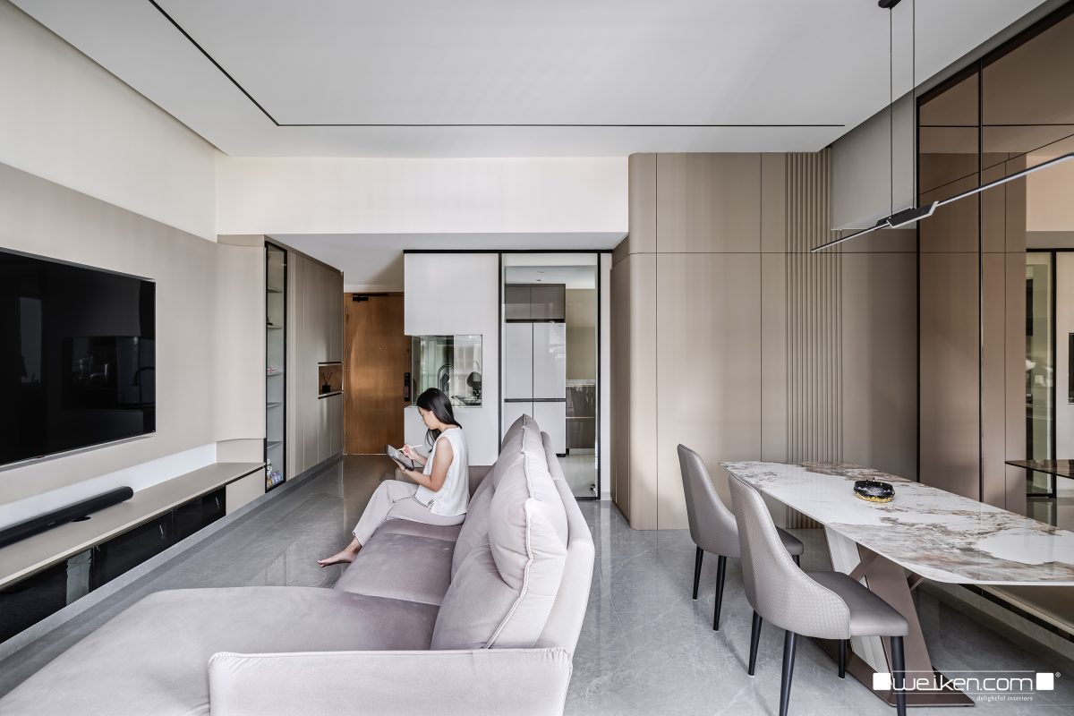
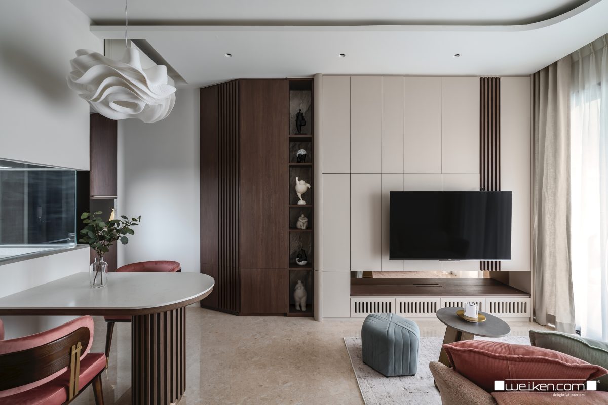
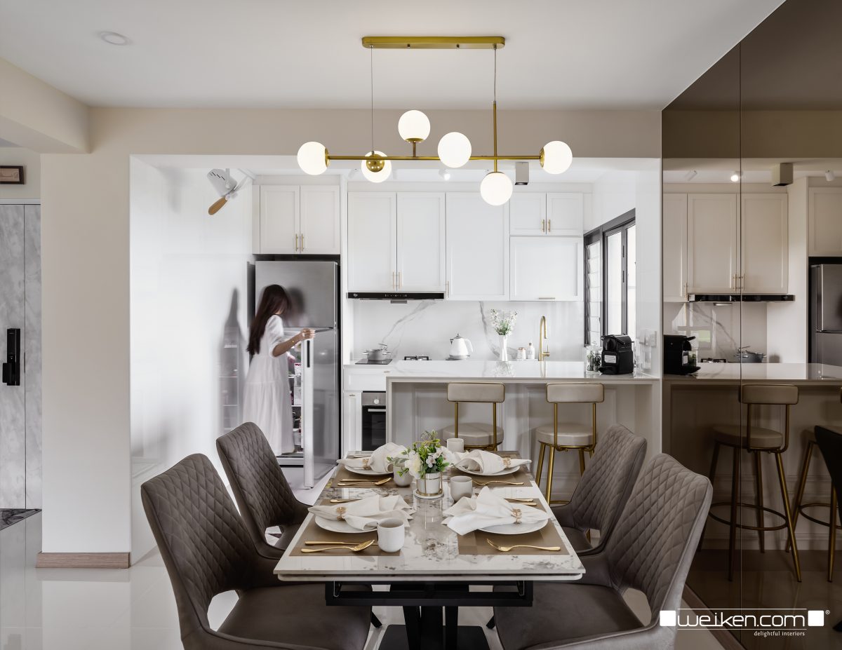
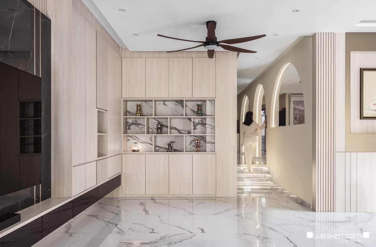
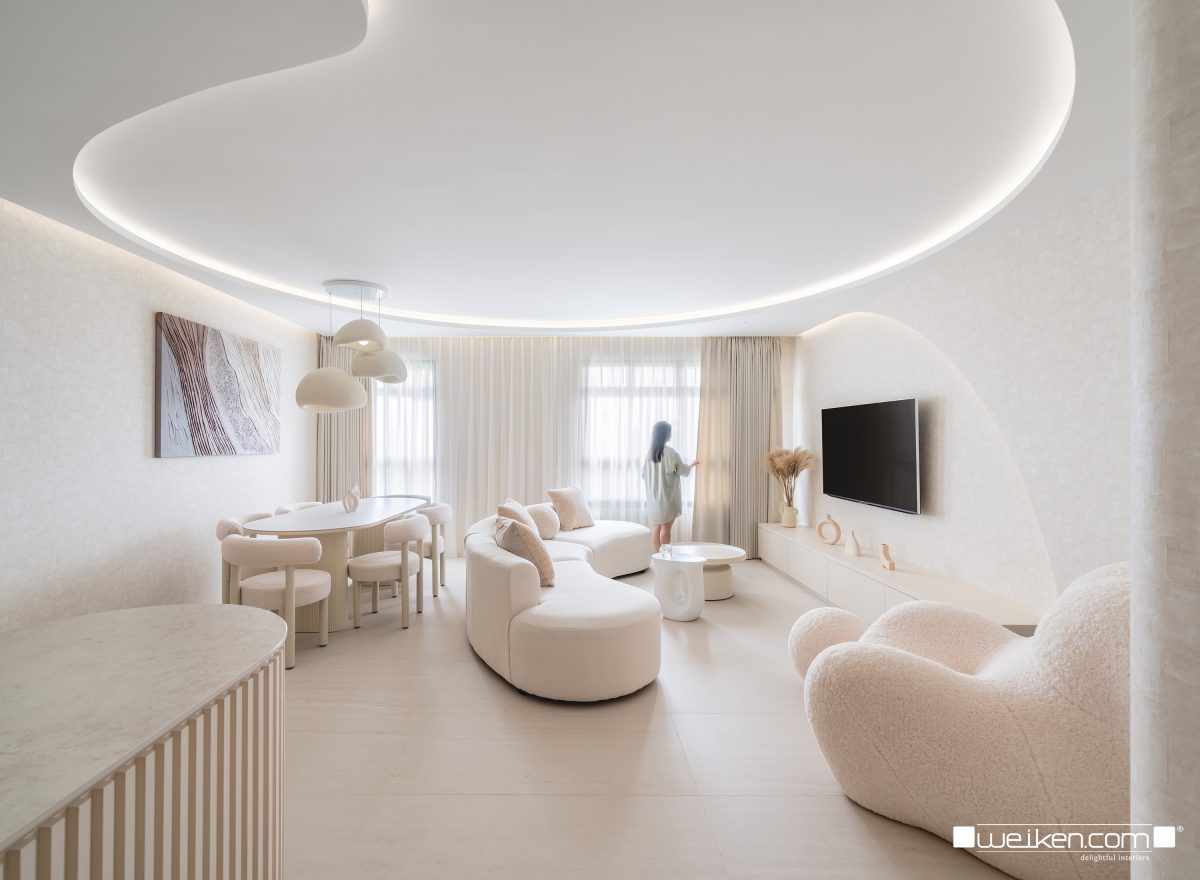
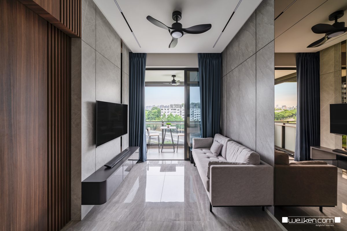
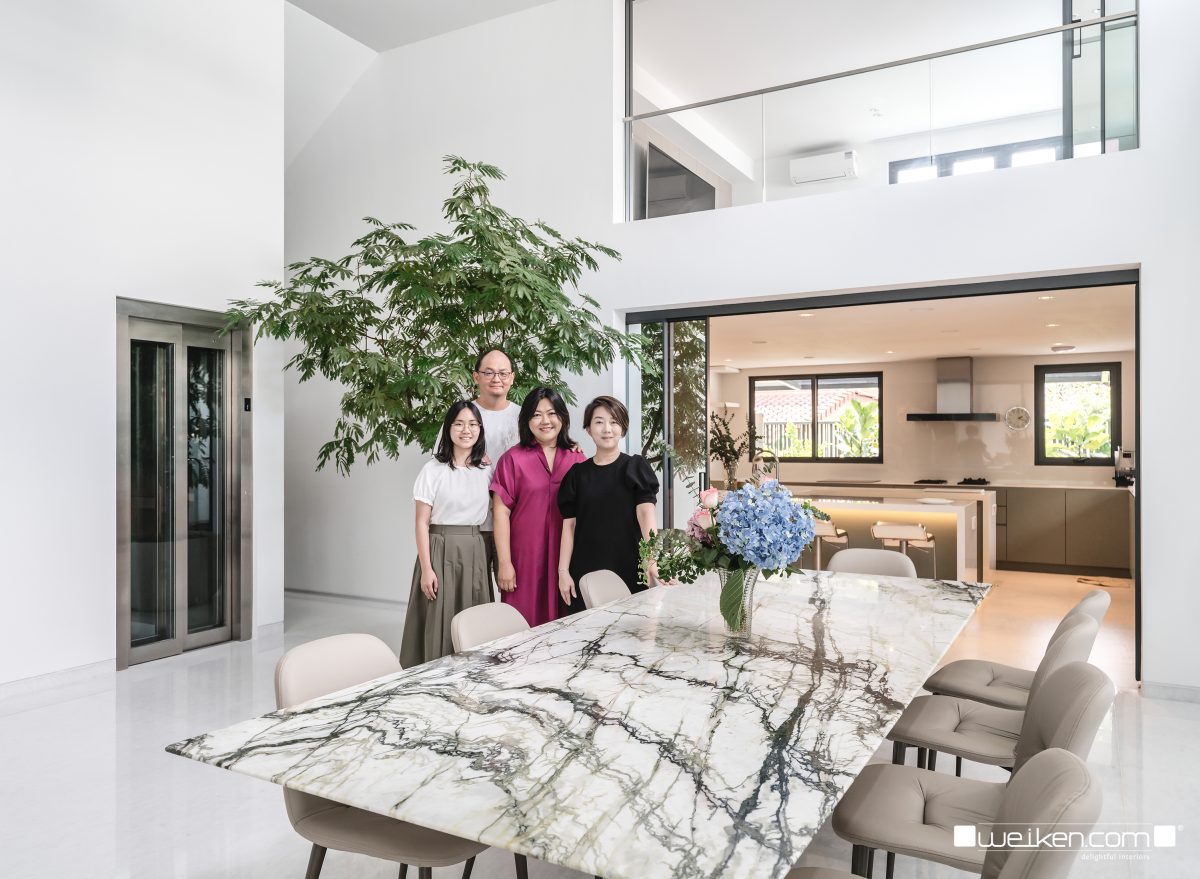
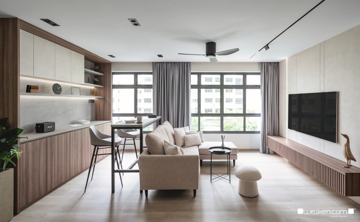
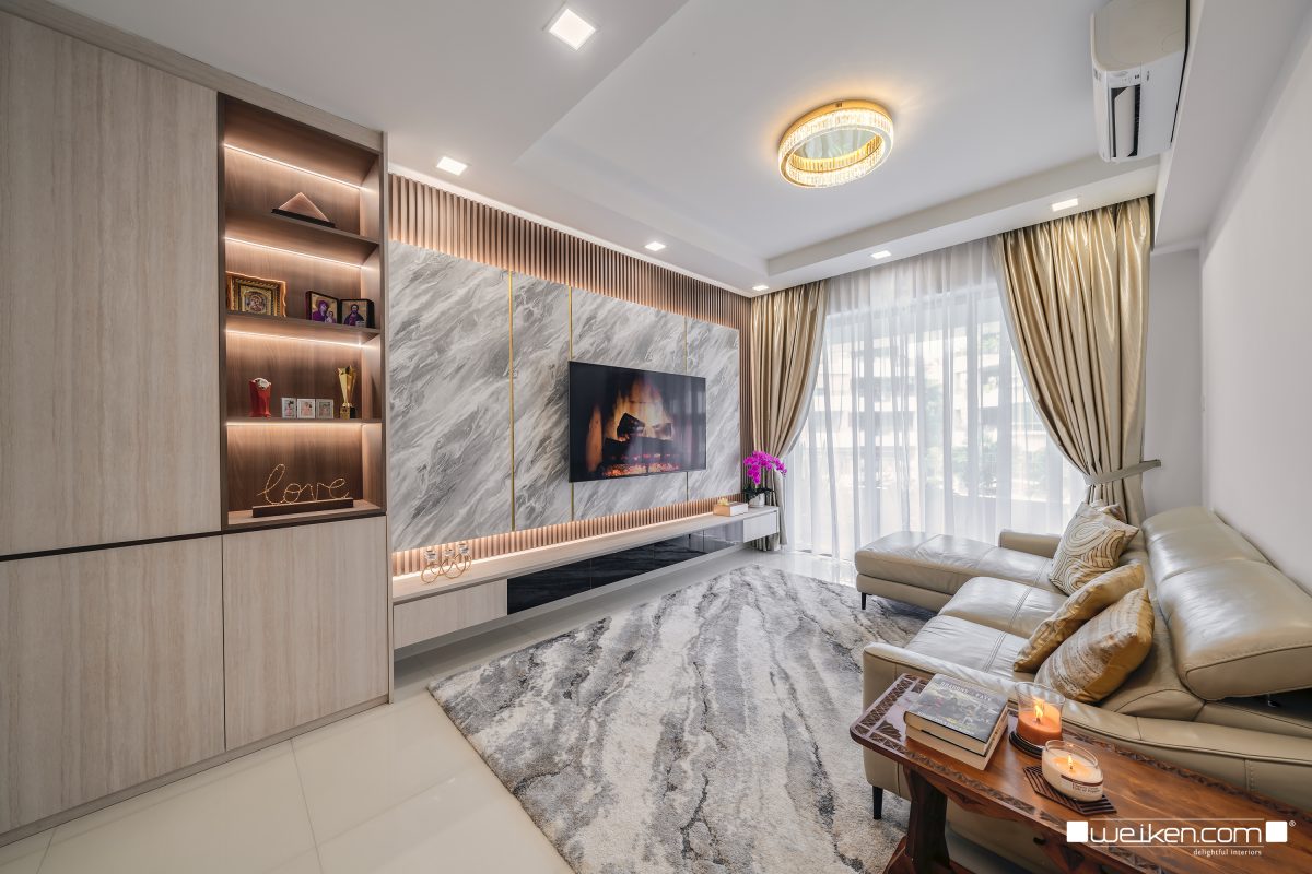
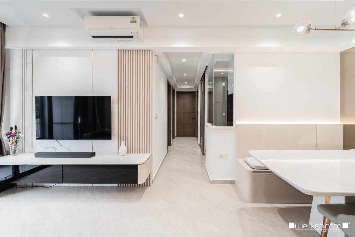
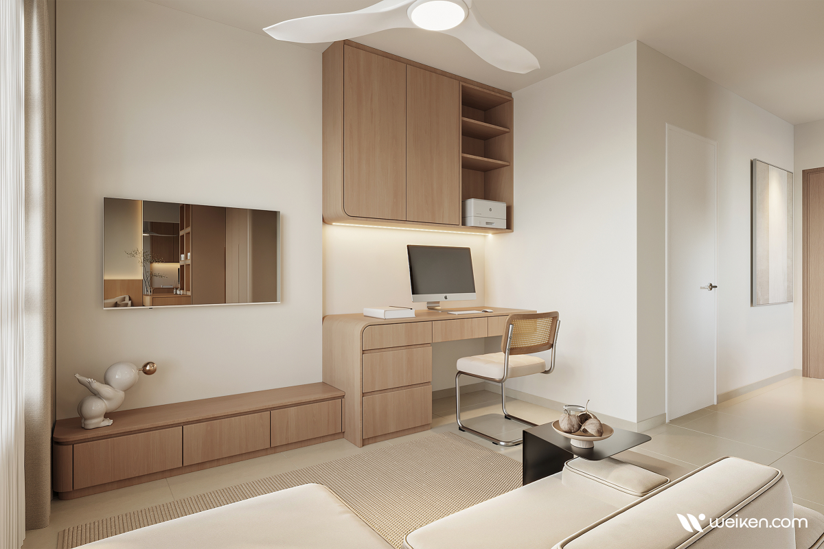
Recent Projects


What they love about us
Derrius is very attentive and very sincere when handling our project. He carefully listened to what I wanted and transformed my space into something even better than I imagined. weiken was also highly recommended by my family.

Authentic Reviews